You are using an out of date browser. It may not display this or other websites correctly.
You should upgrade or use an alternative browser.
You should upgrade or use an alternative browser.
Logo feedback
- Thread starter Daraos
- Start date


HippySunshine
Senior Member
I agree, we need a brief.
This is personal opinion but I don't like shadow effects. I shall give more when I know more.
This is personal opinion but I don't like shadow effects. I shall give more when I know more.
Daraos
New Member
the group contains only a few members > their goal is to create videos about real life & everyday issues that my accur in their life
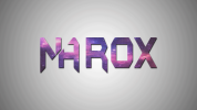
NAROX is the name of the group .. i didn't want to make it look too serious nor useless , so i went with (batman-forever) font and cut the N + A to make it look a bit professional so people take them seriously but not too serious as it will make the logo booring and because they also make funny videos.. so i went & gave it the galaxy color > the picture was not that interesting to actually keep looking at it so i added the drop - shadow effect . i didn't use any other effect really
in my opinion & basing on what they asked me to do that's the closest i could get to simulate what's in their minds
TheAivons
New Member
Those ripples in the background are a bit distracting, and I would like it more if the text didn't have those blurred edges. Perhaps lighten the shadow just a bit or remove it at all and make an effect where text has this nice reflection. Example :
Attachments

It will be a nightmare to print.
Yeah agreedIt will be a nightmare to print.