Logo Design

Status
Not open for further replies.
Umm "refined", "professional", "top notch" - it just doesn't WOW me as a logo design. I think it's because of the pixelated font.

Hey, it's just oy opinion amongst hundreds. But you also have to think as a customer looking in, if I found you on Google as a logo designer and I saw your logo it wouldn't inspire me. I am not trying to be harsh or over critical just giving my view.
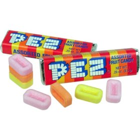
 
It reminds me of these:

Pez.jpg


But not in a good way.

It's just too underdeveloped feeling, a really obvious solution on the "pixel" theme, and a theme I'm not particularly keen on for someone doing logo design, which shouldn't really be done in pixels, should be done as a vector. Pixel art can be SO good, but that's not what you're doing, you're doing graphic design, and that's more than pixel based.

I thought EXACTLY the same thing.
 
No please be as blunt as possible. The new pixelated font was given to me by Tony Hardy...you saying he is wrong?
 
No please be as blunt as possible. The new pixelated font was given to me by Tony Hardy...you saying he is wrong?

No. He isn't doing the logo, you are. This is your logo and it isn't that great that you are now passing the blame onto someone else. The buck stops with you. We have tried to help you with this logo but it is now coming to a stage where we are virtually doing it for you.

The font Tony gave you does not work with what you have decided to do. Thats not Tony's fault. We have also told you on more than one occasion that the logos you were producing were not legible but you have pretty much ignored the advice we have passed onto you. We can only help you and we have tried really hard to do that.

As a designer it is down to you to use the resources available to you and make them work. You say you are a logo designer but you are having more than your fair share of problems with this one.
 
Passing the buck isn't good practise. I suggested a pixel based font that you could try incorporating into your design, all you've done with it, is take it, type PEL using the font that I suggested, type Designs in the same font too, stuck them together and it doesn't work.

That isn't my fault, I was making a suggestion, you took it as literally as possible and typed your 'logo company' initials and went for it.

Without being funny or obnoxious, how are you expecting to run a logo company offering logo designs services for clients willing to pay their hard earned cash, when you can't sort your own logo out?
 
I think you have set a bit of a precedent for yourself here because people on our forum have tried to advise and guide you and you have tried to drop them in it.

One thing you will learn quickly in this business is its sink or swim. If you make a mistake you have to take it on the chin, admit your faults and move on, not blame people who are trying to help you.
 
I wasn't really blaming anyone to be honest. If I have learn't anything is that a lot of contradictions are involved in this industry! At the end of the day like YellowPeril said you have to go with you gut feeling. He told me that he has seen a lot of logos he thought were absolute crap (like basically what you are saying to me about my logo), yet they have sold and made money from them. This is an opinionated business it seems to me. If a client gives you a brief and says here design this for me based on this brief..then you really don't have any control to create something amazing. Just design it and get paid. I have seen hundreds of logos that I think is complete and utter crap, but they have been paid a lot of money for it. As an inexperienced graphic designer does my opinion count?
 
I wasn't really blaming anyone to be honest. If I have learn't anything is that a lot of contradictions are involved in this industry! At the end of the day like YellowPeril said you have to go with you gut feeling. He told me that he has seen a lot of logos he thought were absolute crap (like basically what you are saying to me about my logo), yet they have sold and made money from them. This is an opinionated business it seems to me. If a client gives you a brief and says here design this for me based on this brief..then you really don't have any control to create something amazing. Just design it and get paid. I have seen hundreds of logos that I think is complete and utter crap, but they have been paid a lot of money for it. As an inexperienced graphic designer does my opinion count?

All I see is YOU contradicting YOURSELF!

I haven't seen anyone tell you that your logo is 'crap', all I've seen is constructive criticism. We have given you OUR opinions. You have in many cases decided to ignore a lot of the help you have been given. The first set of logos you showed us were illegible. We have now virtually ended up back at square one. It is an opinionated business, you're exactly right. But you aren't listening to our opinions, you are just doing as you wish, and thats your call. But if you want to come on to this forum for crit you have to expect blunt answers.

You say that YellowPeril said to go with your gut feeling, so why are you still on here asking us for our opinions? Why haven't you gone with your gut? Your opinion does matter as when push comes to shove its YOUR logo, not ours. We have been here to help you through but if you don't want our opinions, hey, thats fine. But don't complain when you ask for them and get them!
 
If it's an opinionated business that who is right? If that is the case then we are all wrong and we are all right...no?
 
Pixels are for web

You say your business is all about pixels, but you design for print and surely all this work is vector rather than pixel? Logos should start their life as vector and when passing files to other designers and print firms ... still .. they should stay as vector.

I would relate 'pixelated' based branding to web services companies only on the whole because the www is pixelated rather than print works.

If sticking with this name and design regardless, I'd also agree that although I think it's looking better than the first concept, it would benefit from a tad more development to look a bit more professional - I think you should drop the slight gradient effect for one and change the font for the tagline to something less 'industrial'.

Remember you are in a service industry, so a hard and straight lines of the design plus the dark charcoal/black colour might feel a bit unwelcoming to your customer base. You are working with customers, people. It's a very people facing profession, thus you should also attempt to feel friendly in your branding efforts.

But, once more I'm concerned that as a logo designer you are presenting yourself more as a web designer in the feel of your logo.

Amanda
 
If it's an opinionated business that who is right? If that is the case then we are all wrong and we are all right...no?

So why are you still asking us then?!

There are rules that applied in design, you do know that right? Many of us on here have spent years learning them rules. There is a cut off point when we have applied the rules and it comes down to opinion. You still have rules to apply. We don't just sit at our computers all day, throw some vectors together and say 'That'll do!'.

You have not yet applied them rules to the logos you have been showing us. Thats why we have been trying to help by telling you how to get round the problems you have had. If the rules aren't there in the first place then the logo, no matter how long you've worked at it will not work. The problem you have struggled with since day one is LEGIBILITY. If you want to use the logo you have created then please do so! We aren't telling you to use it or not use it. All we are doing is ADVISING you that if you do use it, the chances are that it will be illegible!
 
Hmmmmm that is the best advice I have received so far. Thanks Amanda. Makes sense that. Ok ok ok...I am going to make a public apology to everyone on here (especially Ian Bonner)...really sorry, just had a bad day at work and needed to let off some steam. So I'm sorry for that! I will start from complete scratch!
 
CGD...everyone here wants to help and we all have different opinions. There's no clear 'right and wrong' line in the design industry, however, there is good and bad design (even with bad design, some people will disagree). We've been over this before, some people love Carson, others can't see the fascination.

What people are saying is right about your logo, but it's up to you how you take the C&C. If you're happy with it, hey, go for it and I wish you well, but like Ian said, if you post up here, then expect the blunt constructive criticism of people who've been in the game for quite a while.

Back to the logo;
What is it that you want to say about your brand?
What are your personal feelings about where your logo is at?
What do YOU want to do with the logo?

Only by answering basic questions like this can you get a good understanding of what is 'right/wrong' about your design.
 
Also, I don't think starting from scratch is the completely right answer to the problem.

I like the name, Pixel Element, I think PEL even works as an acronym. Just consider what options you have? I think you need a graphic device rather than just text. What is a pixel? A square, a dot, a shape. Answer the basic questions.
 
I think that arguements 50/50. I associate pixels with design as when you create logos, in Illustrator or whatever, you're using computer pixels?

Also, if you just used PEL or Picture Element, you don't have to use the word pixel? And it just sounds like a fairly good brand name :)
 
Hey CGD,

I hope you're doing better now. I'm sorry if any of mine or anybody else's C&C riled you up. I agree with Tony, PEL / Picture Element sounds like a good brand name. Get on to google and look through some logo design work out there, it may just give you some inspiration :icon_thumbup:
 
This user has asked for his account to be deleted so I will lock the thread as no point wasting anymore of your time on this, thanks for your input guys.
 
Status
Not open for further replies.
Back
Top