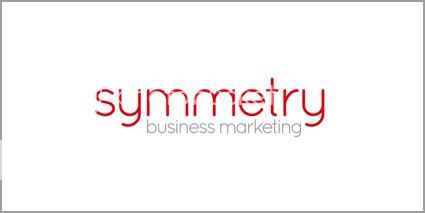
Logo Design for Symmetry Business Marketing

dot design

Member
SymmetryBusinessMarketingLogo.jpg


Full story on my blog: Logo Design for Symmetry Business Marketing | Dot Design - Logo Design and Print Design
 
Nice job Gareth, really like that, simple, clean and effective. Can see the double mm working well on printed items as a large background on an inside fold of folded business cards, brochures. etc..

One super picky thing I noticed is the alignment of 'business marketing' on the left the b lines up with the left side of the m, so looks like the g at the end of marketing should line up with the r in symmetry, but maybe the spacing looked odd with that aligned?

Greg
 
Hi Greg, appreciate your comments, many thanks.

I looked at the spacing on the "business marketing" word underneath for quite sometime and I can see your point but, in my view it worked better the way it has been resolved.

Glad overall its gone down well with you, cheers!
 
I figured you would have done Gareth ;) I was just struggling to find something to be picky about!!
Just kidding, looks great & thanks for sharing.
Greg
 
Picky is good Greg, think all designers are picky, if they aren't there's a problem!

Also questioning why things are the way they are is healthy, thanks for your comments, appreicated, have a great weekend!

G
 
Dot Design said:
Picky is good Greg, think all designers are picky, if they aren't there's a problem!

Also questioning why things are the way they are is healthy, thanks for your comments, appreicated, have a great weekend!

G

Gosh, I don't have anything to say..... Maybe I'm having a Stroke?
 
Back
Top