Logo design, feedback

Woodstockmck

Junior Member
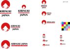
Hi, looking for any comments about this logo I made for my new business venture. I'm based in Japan, and the design was going for a "Japan Quality" concept to differentiate from competitors in other countries. Just a few variations on my final concept. The logo mark alone would look like the Japanese flag on a white background, and loosely based on a famous painting by Hokusai of Mt. Fuji. I'm not a pro designer, more of a web development and marketing guy, but here is my attempt at self-branding. Please let me know what you think! Cheers
 

Attachments

  • kirinukijapan-logo.jpg
    kirinukijapan-logo.jpg
    21.7 KB · Views: 63
I like the second one (the one with the larger text under the red icon). The font reflects where it's from and the red icon also looks like the Japanese flag.

It would help to give feedback if you had numbers for each one ;)
 
Cheers. They are all pretty much the same thing, just presented differently for different uses. The thumbnail turned out really small, but oh well. I was just looking for feedback on the concept.
 
My only suggestion would be to maybe mess with the water(?) under the mountain a little more, really define what that is, or make it harder/ cleaner, like the mountain. Also the red bar text gets hard to read quickly, but it looks nice, so thats going to be a tough one to solve.
 
As James said I would really put a bit of time into tidying up the water as it's not obvious from a first glance. I'm a little short of time right now, but I'll try and get back on later and give you a bit more detail.

As far as layout goes, it would be the second one down as I view it. Not a bad effort at all, just needs a small amount of 'tidying' up.
 
Take out the text and the logo doesn't say 'Japanese' to me.

I know the picture you mean and I know about the flag but to be honest if you take away the red and look at it in black and white it looks like it could represent hawaii, it still does to a point with red too.

In my opinion you need to find something that is more recognisable as Japanese than a 'volcano'

I like the font but I don't like the strap line in the logo as you can't really read it.
 
Back
Top