Ed Sillars
New Member
Hey all,
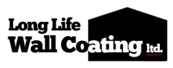
I have a logo commission from a company that does Wall Coatings, I have finished the first draft and would love some feedback if anyone would be so kind to share their thoughts.
There was not too much direction from them design wise (apart from wanting something they can use at the top of letters as well as their website etc.) The name they wanted on the logo was "Long Life Wall Coating Limited" - I checked and they are ok with using 'ltd.' instead.
I was working along the principle that:
- Needs to be very simple with an emphasis on the important words (Wall Coating) - Did this by making those walls the largest font.
- Needs to be recognizable on a van going past quickly.
Am I going along the right lines for this company?
What do you think about the current draft?
Do you think it looks strange cutting off coating at the (co-ating)?

Many thanks,
Ed
I have a logo commission from a company that does Wall Coatings, I have finished the first draft and would love some feedback if anyone would be so kind to share their thoughts.
There was not too much direction from them design wise (apart from wanting something they can use at the top of letters as well as their website etc.) The name they wanted on the logo was "Long Life Wall Coating Limited" - I checked and they are ok with using 'ltd.' instead.
I was working along the principle that:
- Needs to be very simple with an emphasis on the important words (Wall Coating) - Did this by making those walls the largest font.
- Needs to be recognizable on a van going past quickly.
Am I going along the right lines for this company?
What do you think about the current draft?
Do you think it looks strange cutting off coating at the (co-ating)?

Many thanks,
Ed