KarlMarshall
Junior Member
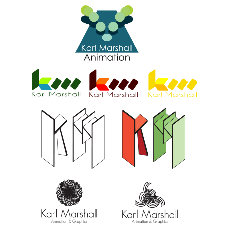
LoL, Yea it does kinda look like a knitting logo, it was just meant to abstract pattern. Okay, so this project is due. I've worked another idea which is basically a ball bouncing. See top of the below logo's, I think that this one is more relevant, but needs work on the colours and fonts. Here are the final set of logos that I came up with from my sketches.