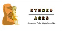
Hey all, I'm new to the forum and just getting back into graphic design. I made this for my coworkers business who uses the scrap granite from our stone shop to make cool things. He was happy with the design but it has been awhile since I have done any design work so I would like to have my work torn apart by people who know what they are looking at please and thanks.
You are using an out of date browser. It may not display this or other websites correctly.
You should upgrade or use an alternative browser.
You should upgrade or use an alternative browser.
Logo Critique please
- Thread starter Schwalmy
- Start date


sprout
Active Member
I’m with Levi. Not wishing to be too brutal, but I am afraid that really doesn’t work as a logo. Typographically, it doesn’t hold together. it is not scalablevand certainly wouldn’t work at small sizes.
The illustration has no relation o the type and most importantly, you have idea of the sort of work produced by this person. The Stone Age man serves no purpose. What is that telling you about the product, or service. Nothing really. The job of a designer is not to adorn. It is to communicate.
Sorry that my response to your first post has been such a slating, but better to be honest, otherwise doing this serves no purpose.
One final criticism; get your coworker to change the name of their venture. It really is awful.
Wardy
Well-Known Member
What's been said before, really. Quite honestly, it's pretty poor. It's a badly produced illustration next to some awful text, with a name that has bad connotations.
If I saw that on a site it would probably put me off buying anything from there.
Choose a better name. Choose a nice font with no effects, there are thousands out there. If you definitely need a mark
then choose something simple and quirky or smart and if you're not an illustrator, don't do it yourself!
Jri
Member
It looks like a transvestite leaning on a pork scratching.
Less is more with this type of thing. Fewer colours, fewer effects on the type and a much simpler visual representation of stone.
As an exercise in minimalism; try picking a single colour, a single font and a simple image that will work as a silhouette* which screams 'stone' (some kind of stone henge outline maybe?).
*the use of a single colour silhouette logo/illustration is a handy trick to tidy up a design if your artistic flair isn't great, and you can't get a pro in to do it.
sprout
Active Member
Sorry Jri, but I have to beg to differ. I definitely wouldn’t go with any sort of stone henge silhouette. That’s just yet another visual cliché. Think about the essence of what this person does. Tell their unique story, not some vague representation of clichéd ideas around stone. That’s up there with ropey black and white cartoons of a man with a paintbrush, you see on the side of thousands of decorators’ vans.
Jri
Member
I see where you're coming from but this is the type of branding which will get a glance, nothing more. In the context of a design forum where people are scrutinising it, maybe not - but in practise, i.e. the real world, it won't get a great deal of consideration from passing Joe Public.
I often feel that as designers we tend to assume that everyone gets wrapped up in the narrative and minutiae of a logo in the same way we do, but people (in general!) are herd animals who pay branding little consciousness. You need something bold, and clichés become clichés for a reason.
Maybe you've got the wrong idea about what I meant. Those pictures of decorator mascots that you described are usually gross and the opposite of minimal design - but the core idea is fine, they just need visual refinement. Case point; if I want a decorator, I pick the print ad with a giant paintbrush, I pick the social media profile with a paint pot avatar etc...
The reason is that the logo is telling you instantly and exactly what the company does, its cliché status is irrelevant.
Aesthetic appeal is desperately important, but a deep and meaningful logo is useless if it doesn't bring customers through the door. Admittedly, larger scale corporate branding deviates from this massively and things tend to get more abstract at that level - but this is a stone off cuts business and not Nike.
Form follows function.
I often feel that as designers we tend to assume that everyone gets wrapped up in the narrative and minutiae of a logo in the same way we do, but people (in general!) are herd animals who pay branding little consciousness. You need something bold, and clichés become clichés for a reason.
Sorry Jri, but I have to beg to differ. I definitely wouldn’t go with any sort of stone henge silhouette. That’s just yet another visual cliché. Think about the essence of what this person does. Tell their unique story, not some vague representation of clichéd ideas around stone. That’s up there with ropey black and white cartoons of a man with a paintbrush, you see on the side of thousands of decorators’ vans.
Maybe you've got the wrong idea about what I meant. Those pictures of decorator mascots that you described are usually gross and the opposite of minimal design - but the core idea is fine, they just need visual refinement. Case point; if I want a decorator, I pick the print ad with a giant paintbrush, I pick the social media profile with a paint pot avatar etc...
The reason is that the logo is telling you instantly and exactly what the company does, its cliché status is irrelevant.
Aesthetic appeal is desperately important, but a deep and meaningful logo is useless if it doesn't bring customers through the door. Admittedly, larger scale corporate branding deviates from this massively and things tend to get more abstract at that level - but this is a stone off cuts business and not Nike.
Form follows function.
fisicx
Active Member
It doesn't to me.The reason is that the logo is telling you instantly and exactly what the company does, its cliché status is irrelevant.
Stoned Ages suggests some sort of pot smoking hippy thing making ornaments out of stones. So I have no idea with the bearded woman leaning on potato means.
Jri
Member
It doesn't to me.
I was referring to the paintbrush logo:
Maybe you've got the wrong idea about what I meant. Those pictures of decorator mascots that you described are usually gross and the opposite of minimal design - but the core idea is fine, they just need visual refinement. Case point; if I want a decorator, I pick the print ad with a giant paintbrush, I pick the social media profile with a paint pot avatar etc...
The reason is that the logo is telling you instantly and exactly what the company does, its cliché status is irrelevant.
sprout
Active Member
Even then, just because it tells you what that person does, that does not make it a successful logo.I was referring to the paintbrush logo:
You talk about designers getting wrapped up in the minutiae of branding. That’s because it’s our job to do so. You are right, the general public don’t usually care on a conscious level, but it is the subconscious level we are working with. The emotional capital is the thing that counts In most cases. Ultimately a logo becomes embed with all the emotional connotations a company builds for itself.
The subliminal signals we read are the triggers which will help people chose one business over another. We usually make these choices emotionally, not practically, so imbuing something with the right emotional undertones and overtones should not be underestimated.
Jri
Member
Even then, just because it tells you what that person does, that does not make it a successful logo.
No, but it is a prerequisite of a successful logo.
You talk about designers getting wrapped up in the minutiae of branding. That’s because it’s our job to do so. You are right, the general public don’t usually care on a conscious level, but it is the subconscious level we are working with. The emotional capital is the thing that counts In most cases. Ultimately a logo becomes embed with all the emotional connotations a company builds for itself.
The subliminal signals we read are the triggers which will help people chose one business over another. We usually make these choices emotionally, not practically, so imbuing something with the right emotional undertones and overtones should not be underestimated.
No, I was actually talking about wrapping up customers in all of the finer points of design consideration.
The subliminal emotional stuff is right, but it’s all dealt with behind the scenes at a design phase by us and served up to the customers subconscious that way. It’s the functional stuff that should be spelled out to the customer, not your thought process.
Not wanting to get bogged down in a full on design theory lecture, but for me it’s horses for courses, if I were designing something that was going to get wide scale commercial levels of visibility then yes, a massive amount of development would go into rounding off the emotional connotations and subtler references. Like with the A-Z motif in the Amazon logo, this isn’t that though.
You have to be realistic about what this is, someone who’s not a confident designer producing a logo do a friend’s trade sideline - so the basics need to be sussed before the Sagmeister textbooks come out.
It needs to be simple and effective.
Jri
Member
No, but it is a prerequisite of a successful logo.
Upon reflection, this isn't entirely true but it certainly isn't something that impedes a logo's success.
scotty
Ultimate Member
Sorry to hijack the OP's post but I was always told that a logo's job was to identify and not communicate.
If you search around it's one of those things that is almost written in stone (no pun intended) and a set rule of design.
I think this is true for very large companies (think Golden Arches) but not really for smaller companies where it is actually can be important to communicate what they do through their identity.