You are using an out of date browser. It may not display this or other websites correctly.
You should upgrade or use an alternative browser.
You should upgrade or use an alternative browser.
Logo critique please...
- Thread starter wrapture
- Start date
scotty
Ultimate Member
I agree.
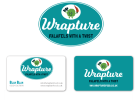
If the logo was much smaller then you'd struggle to see what the little guy was and I quite like him.
It's also like a frame within a frame if you get my drift.
I think the font works but you could choose a better one.
There are some lovely flowing scripts that look quite hand rendered which would look nice.
Martin Scurry
Member
in middle of the logo which is you added boy pic it is not much visible. i think you can add this in some other place with a different angle it is more suitable for you.View attachment 5095
Hi,
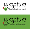
I'm looking for some feedback on a logo for a new falafel street food venture.
All feedback is welcome.
Thanks
Paul Murray
Ultimate Member
I'd drop the mascot and just do something typographic. The little falafel cheapens the brand and doesn't scale down well. I think the font choices are way off too.
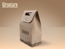
Falafel is middle eastern, I'd suggest that the branding should hint at that as that will strongly indicate to passers-by the type of food you're selling. Maybe incorporate some middle-eastern patterns into the packaging. A font like Medula One has subtle curves that give it an eastern feel without being too over the top. I've mocked up an example to show you. You can further reinforce the idea of middle-eastern through colour and such like.


Also, the tagline says there's a twist, but I'm not seeing it, just a standard logomark with text. What's the twist with your wraps and can you hint at that with the branding?
Falafel is middle eastern, I'd suggest that the branding should hint at that as that will strongly indicate to passers-by the type of food you're selling. Maybe incorporate some middle-eastern patterns into the packaging. A font like Medula One has subtle curves that give it an eastern feel without being too over the top. I've mocked up an example to show you. You can further reinforce the idea of middle-eastern through colour and such like.


Also, the tagline says there's a twist, but I'm not seeing it, just a standard logomark with text. What's the twist with your wraps and can you hint at that with the branding?
wrapture
New Member
Thanks again for this invaluable input. I like that typeface it's definitely got the middle eastern feel.
I think i probably prefer a more typographic logo but the folk back here want some kind of character:-/
I've certainly got some food for thought with your feedback though so thanks again, i will go away and have a rethink!
I think i probably prefer a more typographic logo but the folk back here want some kind of character:-/
I've certainly got some food for thought with your feedback though so thanks again, i will go away and have a rethink!
Paul Murray
Ultimate Member
I'd urge them to think about what their customers are going to want. Fast, fresh, delicious, traditionally hand-prepared street food at a reasonable (but still high) price. The client may want a character but I still maintain it will cheapen the brand unless done very well.I think i probably prefer a more typographic logo but the folk back here want some kind of character:-/
'Wrapture' is a cool, hip name and memorable enough alone without a mascot or icon. "Have you tried that new falafel wrap place called Wrapture?"
By keeping it simple you have more flexibility with applications too. It's important not to back yourself into a corner. Having to use green for example, how will that look on packaging? Will it require different paper or print methods to maintain a vibrant colour on, say, recycled wrappers? Does green even imply 'falafel with a twist', or does it perhaps suggest a juice bar? That chilli could be seen as a carrot from a distance.
Typographic logos work really well in so many applications due to their flexibility.


