Fernando Balandran
New Member
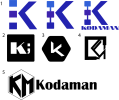
Hi, I am new to this forum. A bit about myself I am a programmer, web dev, apps and games dev. I've never considered myself the artistic type. I followed a bunch of youtube designers and tried to learn the process of designing a logo. I did some mind mapping with related words. I sketched around 30 to 40 ideas on paper, and these five were the ones I liked the most.
I was trying to convey something about programming, pixels, and maybe something about building software, and yes I know logos don't have to mean what your business do. It is really harder to come up with abstract logos. I really thought some looked really clean, and professional, but I could never know what's too simple or too clean. It was really tough to come up with ideas in the beginning, but I gave it my best try. Either way I will keep working on my artistic skills, I really enjoyed working on this logo on paper.
Thanks for the critiques in advance!