candiceusa
New Member
Hi,
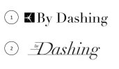
I'm looking for feedback on the two logo concepts below.
The first one focuses on a sparkle element that will also be used as a favicon, and image for social media. The sparkle evokes the "dashing" aspect of the gifts, but also speed, and also looks like a stylized package.
The second one exacerbates more the speed, but keeps a classic Didot base font for the more classic, high-end look. It's a more modern logo. The D alone (without by inside) will be used as a favicon. The letters will be adapted to align with the stripes of the D and look more streamlined.
Thanks for your feedback!