nathalia.colling
New Member
Hi everyone !
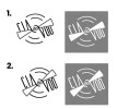
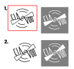
I am doing this logo for a Theatre company that calls “CIA DO VOO”. It would be in english something like “Flight Company, or Flying Company”
There are two samples of the same idea but with a little difference between them.
I prefeer the first one, where the type is incomplete and hiding behind the propeller.
My doubt here is that I am afraid that the word VOO could lose its readability, and could seem like VUU instead. I think there is also the fact that you see the propeller and associate with the word VOO, but I am not sure if it is happening here.
That´s why I came with this second option, but still prefeer the first one…
Could you guys please give some feedback regarding this little issue I am having?!
Thanks!!!
Nathalia Colling

