Leeds United Branding?

scotty

Ultimate Member
screenshot2018-01-24at162911.png


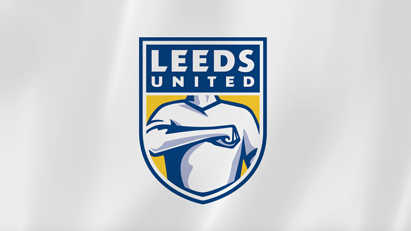
Just wondering what others were thinking of the current Leeds United badge design and the kerfuffle surrounding it?

I'm not into football but you can't escape this at the moment even if you're not into footy or design.

Personally, when I saw it it left me a little confused.
More in the way that that I had no idea what that 'salute' meant (not a Leeds fan either) and why they'd opted for the representation of a person.
A salute can come across as oppressive or factional and maybe have a hidden meaning to the uneducated.

Also... the use of a figure?
A single figure can't be representative of a group especially when it's specific.
It's obviously a white, adult male and some people could take offence at this.

It's also an open door for parodies and as we know, football fans are very good at these and I've already seen a hell of a lot of them.
I could think of countless.

I don't really know how this got passed or even past the concept stage given the 'design by committee' that must have been involved.
It just reminds me of The Emperors New Clothes story.

Plus the shading on the arm is wrong. ;)

What are your thoughts?
 
Logo development should never take on a new logo, it should be development from previous logos.

Especially when it comes to something that's fan based, and driven by the fans, the love behind a logo/crest is too great to change immensely, it should be updated, modernised and make relevant, but never changed to a completely new logo.
 
As a Leeds fan I am absolutely horrified. Shocking!

As a Designer I am absolutely horrified. Shocking!

I know that unveiling new branding is like throwing yourself to the wolves (not the football team) but why?
You could go on for ages about what's wrong with it and how many branding faux pas there are.
Did nobody spot any along the way?

It goes against SO many things I know about branding and makes so many mistakes.
It just screams "Tear me a new @rse hole...PLEASE!".

It'd have been better representing a "face, palm".

I feel sorry for Leeds fans as it's going to take a long time to live this one down.
 
It's being replaced as we speak. Terrible that it got that far after apparently 10,000 individual consultations.

I guess this is a lesson in crowdsourcing...
 
What demographic did they consult?

10,000 white males that couldn't see the wood for the trees?
Were they all pissed at the time?

Now they have the problem of creating another with everyone's critical eye on them.
No thank you!
I wouldn't touch that one with a sh@tty stick.

I'd just revert to the old one and sit in a hole until the whole thing blows over in a few decades.
 
It looks very Americanised, like NFL or hockey team emblems. I'm not into football at all, what's the deal with the arm across the chest? It looks like he's about to do a Nazi salute.
 
It looks very Americanised, like NFL or hockey team emblems. I'm not into football at all, what's the deal with the arm across the chest? It looks like he's about to do a Nazi salute.

I thought the same.
Kind of American sports team mascot branding.

That being said, I quite like that style in the right context.

The salute (correct me if I'm wrong @hankscorpio ) is one that Leeds fans use as a mark of pride.
I guess if you're not a Leeds fan or know that it could be misinterpreted.
 
Have to be honest I wouldn't know what that salute stands for but I do know it's used in a lot of anime with 'military' groups in them as their 'salute' to commanding officers and the likes. Supposedly it's supposed to be something to do with having heart/belief or swearing allegiance.....yeah it's new to me too.

The whole design does scream 'America' though at the same time, it's got that nfl vibe, the pose could easily be changed to the 'hand on heart' when singing the US national anthem etc. I'm no leeds fan but I can't see it going down well lol
 
History is littered with examples of rebranding cockups.

I remember when Abbey National changed a trusted brand to a daft smiley face thing that nobody liked. A few months down the like they were taken over by Santander making the whole exercise pointless.
 
…the pose could easily be changed to the 'hand on heart' when singing the US national anthem…

…whilst Donald Trump, wearing blue jeans and white trainers, sours above on the back of a bald eagle, draped in the American flag and firing a machine gun in time to The Start-Spangled Banner …

Yeah! Patriotism!
 
Someone likened it to half way between Sieg and Heil, which I thought was funny.

It looks to me like he's just given someone a right hook, quite apt if you're a Leeds fan. ;)
 
And I thought the new F1 logo was bad!

From a huge football fan perspective, it is sh!t. From a passionate designer perspective, it is even worst!

It looks to me like he's just given someone a right hook, quite apt if you're a Leeds fan. ;)

Haha! Take a bow!

Logo development should never take on a new logo, it should be development from previous logos.

Especially when it comes to something that's fan based, and driven by the fans, the love behind a logo/crest is too great to change immensely, it should be updated, modernised and make relevant, but never changed to a completely new logo.

;) Like this:

arsenal_crest4.jpg
arsenal_crest5.jpg
 
It's a 'wood for the trees' sort of thing. While the salute connotations and the white male dominance thing are pretty bad, they actually distract from two much more basic problems.

1) As Scotty touched upon with the shading, the drawing of the man is simply shit. Looks like a vector trace of Windows 95 era clipart.

2) The execution (i.e. the actual physical drawing of the logo that the under paid intern has to do, the bit AFTER the over paid art directors and the focus groups get their input) is shocking, especially for something as well financed as a football club job. I don't read much news, so I've missed this story - but upon seeing this thread, here are just a few of my initial observations (basic stuff too).
 

Attachments

  • Leeds.png
    Leeds.png
    40.4 KB · Views: 8
It's a 'wood for the trees' sort of thing. While the salute connotations and the white male dominance thing are pretty bad, they actually distract from two much more basic problems.

I think the connotations of a white, civilian, male football supporter making a salute gesture are well....? :unsure:
I know it's just a symbol of pride thing within the Leeds fan base but it's how it's seen by others.

I did try and search as to who actually designed it but couldn't find anything so not sure if it was done in-house or by an outside agency.
I'm kind of thinking it was in-house as I doubt any agency worth their salt would have suggested this.
Maybe the art direction was coming from the top of the club from people with no branding experience?
I'd be interested to know.
Either way it does suggest some insular thinking hence the Emperor's New Robes comparison.

As Jri pointed out, the actual technical aspect of the art-working leaves something to be desired.
That's just basic sloppiness and you can't even pass that off as being visually correct like when people diss the Google logo.

I don't read or watch the news at all but this is all over pretty much every design blog and portal at the moment.

I don't usually bother with things like this, when people start ripping apart new logo's to the ultimate level but this is just SO wrong in SO many ways.

What on God's earth were they thinking?
I'd be under a stone right now if I'd have had anything to do with it. :D
 
Back
Top