Leaflet Design

The Simulator

Active Member
Hi Everyone,
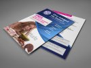
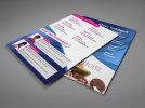
This is the front & back for an A4 folded leaflet I'm working at the moment.
All of the main info will be going in the inlay.
Anything majorly wrong with it so far etc etc?

View attachment 1284
View attachment 1283

Cheers,
Mark
 

Attachments

  • lfw-easter-ad-back-front.jpg
    lfw-easter-ad-back-front.jpg
    67.7 KB · Views: 40
  • lfw-easter-ad-front-back.jpg
    lfw-easter-ad-front-back.jpg
    65.4 KB · Views: 49
She appears to have a watermark over her face.
BBRM4(15).JPG
 
I wouldn't say anything majorly wrong, it's good. The only thing I worry about is the blue and pink colours, more so on the front than the back. It feels like they clash a little bit, maybe it's just me.
 
Squiddy said:
The only thing I worry about is the blue and pink colours, more so on the front than the back. It feels like they clash a little bit,
take it you haven't seen your 'advert' up top then :p
as to the leaflets... I'm not sure the woman appreciates her head being chopped off, personally I'd 'lower' her in the space
 
It works in the advert because the design isn't so busy and doesn't consist of gradients and so many different shades and tints :p
 
Back
Top