workrobotwork
New Member
Hi,
I need to ask help with what is probably a very simple design issue. I'm a writer by trade and have very little coding or design experience, but I'm trying to learn. I'm currently assembling a portfolio of my work in the form of a webdoc. I am using Klynt to do this.
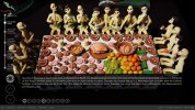
The idea is to link my articles/clippings in sequence according to country. There is an interactive map that allows users to preview and select sequences. The clippings are intended to profile my photos as much as my writing with the end result something like a photo essay. The interface consists of a menu that allows users to skip to individual clippings within the country sequence/return to the map, and three buttons: up page, down page, reveal/hide text. The design evolved organically (no idea what I'm doing really) so that I seem to have arrived at three basic layouts.
1. Faded background image with right-aligned text. Suitable for short clippings under 400 words.

2. Left-aligned box and text, which provides contrast to the navigation and menu buttons.

3. And finally, a box-aligned with the bottom of the page where I cannot decide whether the text should be left aligned, centered or right-aligned. Whatever I choose, there is unused black space and/or a sense of unbalance. I cannot shorten the height of the box because that would cut through the three navigation buttons (not such a problem with dark photos, but there are light backgrounds which would obscure them). I was wondering what the best compromise would be, or if there was a solution I had not considered yet? I would appreciate any help at all.
Thanks, Richard
(p.s. having some trouble uploading these images, so I'll post them below as a reply to this thread)
I need to ask help with what is probably a very simple design issue. I'm a writer by trade and have very little coding or design experience, but I'm trying to learn. I'm currently assembling a portfolio of my work in the form of a webdoc. I am using Klynt to do this.
The idea is to link my articles/clippings in sequence according to country. There is an interactive map that allows users to preview and select sequences. The clippings are intended to profile my photos as much as my writing with the end result something like a photo essay. The interface consists of a menu that allows users to skip to individual clippings within the country sequence/return to the map, and three buttons: up page, down page, reveal/hide text. The design evolved organically (no idea what I'm doing really) so that I seem to have arrived at three basic layouts.
1. Faded background image with right-aligned text. Suitable for short clippings under 400 words.
2. Left-aligned box and text, which provides contrast to the navigation and menu buttons.
3. And finally, a box-aligned with the bottom of the page where I cannot decide whether the text should be left aligned, centered or right-aligned. Whatever I choose, there is unused black space and/or a sense of unbalance. I cannot shorten the height of the box because that would cut through the three navigation buttons (not such a problem with dark photos, but there are light backgrounds which would obscure them). I was wondering what the best compromise would be, or if there was a solution I had not considered yet? I would appreciate any help at all.
Thanks, Richard
(p.s. having some trouble uploading these images, so I'll post them below as a reply to this thread)