I'll leave it with you!

01 or 02

  • Logo 02

    Votes: 0 0.0%
  • Neither

    Votes: 0 0.0%

  • Total voters
    1
  • Poll closed .

Woocksie

New Member
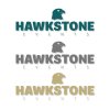
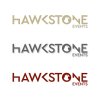
Hi, I'm in a cul-de-sac with this logo and this is where I give up and finish the walls I have to paint. Please feel free to rip into it and tell me whatever comes to mind. The brief was not much, I am at my 9th or 10th logo for my customer and every time the brief is less and less... "I leave it with you, you know me by now...". PS. Don't be gentle!:cool:
 

Attachments

  • HawkStone Events logo 01.jpg
    HawkStone Events logo 01.jpg
    245.8 KB · Views: 10
  • HawkStone Events logo 02.jpg
    HawkStone Events logo 02.jpg
    238.8 KB · Views: 10
If you're on your 9th or 10th design for a customer then it's pretty clear you're either not understanding what the client wants or they're not explaining the issues they have with it.... whichever way it is it basically boils down to communication between you and the client and we can't really help with that.

I can give you one obvious issue wit the 'logos'... they lose all the small details when you shrink it down to the thumbnail size......
Sorry, Lost in translation... 9 or 10 the finalised projects... It is a returning customer...
About the details, you're right... thanks
 
1674407395967.png

Can you read it?


1674407429296.png
Can you read it?


Personally - I like the K in hte 2nd version and put the hawk perched on the stone.

More like
Hawk
Stone


Anyway - either way - legibility is against you.
 
Sorry, Lost in translation... 9 or 10 the finalised projects... It is a returning customer...
Then you need to ask for more details on those you feel don't have enough. It's still a communication issue in some respects.

It's a bit like me being asked to design a desk to fit in a space in an office but they don't give me the width measurement... I can design the desk but it will never be correct because I don't know how wide it is and that one missing detail might make a huge difference to the finished designs usability.
 
Number one all the way. Events might need to be a bit bolder. There's too much going on with the second one, all the different letters doesn't really work.

Lose all the drop shadows, definitely.
 
View attachment 8490

Can you read it?


View attachment 8491
Can you read it?


Personally - I like the K in hte 2nd version and put the hawk perched on the stone.

More like
Hawk
Stone


Anyway - either way - legibility is against you.
I've asked about 2 words or one because it is a beer called like this but he said he wanted one word... thanks anyway ... the "events" is too small I agree but thought the size doesn't matter even though my wife tell me otherwise.:unsure:
 
Back
Top