You are using an out of date browser. It may not display this or other websites correctly.
You should upgrade or use an alternative browser.
You should upgrade or use an alternative browser.
Ideas for designing a logo/ symbol for a window tinting company
- Thread starter Yas
- Start date
Ideas are your department. We can certainly offer you critique on the designs/sketches you come up with.
Your first step would be to understand your brief from the client, if you've got open questions then you need to verify the answers before continuing.
I'd then move on to logo research - their competitors - and what others have done in the market.
https://www.google.ie/search?q=wind...z7TPAhXmBsAKHd0BBP0Q_AUICCgB&biw=1118&bih=878
You can then take the brief - which should have sample colours, perhaps other logos they liked (not necessarily window tinting) and start sketching (by hand - it doesn't matter if you suck at drawing - like I do!)
Once you have a good range of sketches and ideas - pick the best 3.
And start producing them digitally on the computer.
Start off in black and white - then add colour as you go.
Stick to max 3 colours for a colour version.
And if you want - make an embellished version with effects and razamataz for their online presence.
Let us know how you get on!
Paul Murray
Ultimate Member
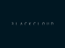
Why not think differently? Rather than a logo that represents window tinting, how about a simple type treatment or visual style you can apply to different things that reflects this? Translucent business cards for example, or simple type that is darkened on one half. As a quick example I knocked this up for a friend to try out an idea:
 .
.
Rather than a literal logo (a black cloud), the idea here is the name of the business looks partially obscured by a black cloud. This idea wouldn't transfer too well to print or other applications (and it's not 100% legible) but you could look at doing something simple with some type that gets the concept across much better than a logo.
 .
. Rather than a literal logo (a black cloud), the idea here is the name of the business looks partially obscured by a black cloud. This idea wouldn't transfer too well to print or other applications (and it's not 100% legible) but you could look at doing something simple with some type that gets the concept across much better than a logo.
Thanks for the response guys.
The current name that I have is "Lightless"
Your critique is welcomed, do you think its a good name? does it work?
I have been experimenting with the idea of Light as the bigger players in the market who supply the film have their names along the lines of something to do with the Sun.
Names include companies like Llumar, SunTek, SunGard etc
I do like the idea of the darkened logo, but I feel it would make printing onto different backgrounds and materials difficult.