Help! First exhibition stand design...

amberray84

New Member
Hi! This is my first time posting here...

I have been tasked with designing an exhibition graphic for my company - even though I've never designed anything near this scale! The Directors have largely had a hand in the design as they are quite picky about what should go where (they are not designers).

A big note - when I agreed to this, the company we are ordering from and who are printing did say they would give me advice during design, but that HAS NOT happened. Now I am just freaking out a bit, as this is a big investment for our company and I don't want to mess it up!

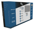
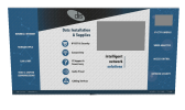
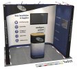
Just to explain what you see - the black ends are end caps, the blue sections consist of 2 panels each, and the centre consists of 2 900mm panels with 2 flexi 550mm panels that will be bent at right angles. There will be a 40" screen above the text "intelligent network solutions" and a 21" screen on the far right IP CCTV & Security panel. Overall height is 2250mm.

The graphic directly below is the podium wrap.

To me it looks really plain, but Directors are happy. I originally had more elements, but they have asked to remove and simplify. Please give me advice! Also, I did have an Adobe stock image across top of left 2 blue panels, but will this print correctly at this size??? help!

Many thanks for your help.

DIS Twist Hardcase Double Wrap Graphic  copy.jpg
 

Attachments

  • Twist Graphic 3 x 2 copy.jpg
    966.1 KB · Views: 8
Sorry I meant to get on to this but got distracted by something shiny!

The wrap thing is fine, the less busy the better.

Anyway - on the attachment - the text is not aligned and will really show printed at large scale - really noticeable on the right side.


Overall - it's clean

You could be clever and align the text to beside the "nodes" on the network paths.

Text at the bottom is right on the ground - I'd consider moving that panel to the top and making the text slightly larger.


I think it will look extremely well when insitu.


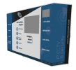
Is it going to look something like this? Or will the panels be at more of a 45 degree angle?


Screen Shot 2018-03-09 at 14.14.00.png


Screen Shot 2018-03-09 at 14.14.04.png


Screen Shot 2018-03-09 at 14.14.09.png
 
Thank you so much for your thoughtful reply. As I work on my own I have no one to bounce anything off, anyone to tell me when I'm way off base, etc, so I end up spending my time fretting instead!

When you mention the text alignment, are you referring to the right and left sides?

Here is a CAD which will give a better idea:9946 v2 (With Graphics).jpg
 
PS I really like the idea of aligning text with nodes on the network paths, I'll definitely do that - thank you.
 
Actually it's probably just me - they're similar in lenght and I see they may be centered - but it looks a bit off

Ah I see - I bent the podium the wrong way around :O

Text on the floor does lost - I'd definitely fight for that to be top

Audio visual icon - only looks like an Audio sign - see if you find something with a screen https://www.google.ie/search?q=audi...-ud_ZAhWEvRQKHRBjDkwQsAQIKA&biw=1446&bih=1119


Overall - it looks very well.

No wonder the other crowd did not have to direct you on the design. You pretty much got it all spot on.
 
It was probably due to my very poor description of how it will stand haha - didn't have the CAD to hand at the time of posting either.

Whoops- yes Audio Visual does need changed, thanks for pointing that out. I'll see what I can do about the bottom strip and text.

Thank you thank you thank you - the longer I've worked on this the more I've started to worry that I'm way out of my depth... thank you for putting my mind at ease.
 
Think you pretty much nailed it - can't say much else about it.

Looking forward to seeing the finish.

PLUS - get a pic for your portfolio! Wonderful piece for it!
 
If the render is anything to go off I think it will look really good. I've done a few exhibition stand graphics and it's always nerve-wracking due to their size, cost, and importance.
 
Based on the cad image my thoughts are.

  • I'd maybe try for a little more white space between the big tv and the text to it's left, it's a little close to my eyes
  • Not sure I like the Data Installation and Supply header being right aligned when everything else is left aligned on the left of the back wall.
  • intelligent network solutions under the back tv, I'm not sure it's going to sit middle of the tv... actually you might want to just check the 'balance' of the text in relation to the tv's in general.
  • The text at the bottom is going to be lost completely by people standing in front of it and the feet blocking it so like others you either need to look at losing it or moving it to the top for more visibility.
  • I feel the dis logo (back wall) needs to be moved to the left a little, it seems a little too far to the right
  • IP CCTV text is maybe a little too high on the right side when next to the tv, I'd maybe look to see about having it level with the top of the tv

These are all excellent suggestions - after staring at it for so long I start to lose focus on the details. I'll change all of these! Many, many thanks :)
 
Back
Top