Gin Label Design advice

Bit_Stupid

New Member
Hi All, newcommer here so apologies if I don't stay on the right side of the forum best practice first time!

Any way looking for adice on some label designs. Not so much advice on the design but advice on how I can keep the ethos going but reduce the amount of ink the final print will use. I use a professional label printer and the results are great but the ink bills are not so great! It needs to stay quirky colourful and eye catching but I need suggestions on how to lower the amount of ink the design will use. Anything I try winds up looking stupid and just too much obvious and dead looking white space.

Typical front label attached (back label is similar with description & legal info just). Other versions follow same striped format with different colours
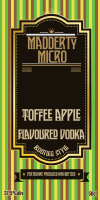
Apple-Vodka-01.png
 
ahhh…ok. That makes more sense. To be honest I'd be probably looking at an alternative design that is created to take that kind of issue into consideration. There are so many boutique vodka/gin brands out there now and the design standards are high in such a competitive market. Starting with technical/cost restraints is an interesting angle to begin the design process from and can lead to some really interesting/creative work. Clean/minimal designs will stand out on shelf a lot better and use a fraction of the ink.
 
Honestly the only way I can think of to reduce that ink usage is to knock stuff out of the design (I think it would work better without the stripes anyway) or work on a 'coloured paper' and adjust the colours to work with said paper.

And a minor side note... since when has flavoured vodka been gin....
 
You can distill gin from vodka, I'm guessing if there's any such change to the vodka then it might be labeled "Gin" as it's not techincally vodka - but I don't really know.

Anyway.

Too much ink usage - reduce the amount of colours overall.. that's all I can think of!
 
Lose the stripes, lose the solid black, make the label smaller or print on coloured stock e.g. pale green for apple etc.
 
Hi All, newcommer here so apologies if I don't stay on the right side of the forum best practice first time!

Any way looking for adice on some label designs. Not so much advice on the design but advice on how I can keep the ethos going but reduce the amount of ink the final print will use. I use a professional label printer and the results are great but the ink bills are not so great! It needs to stay quirky colourful and eye catching but I need suggestions on how to lower the amount of ink the design will use. Anything I try winds up looking stupid and just too much obvious and dead looking white space.

Typical front label attached (back label is similar with description & legal info just). Other versions follow same striped format with different colours

View attachment 5728

thats pretty sick (y)i like the colours
 
Back
Top