Renniks
Senior Member
What do you think?
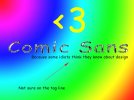
I wasnt sure on the tagline, so made sure my audience knew this...
The rainbow colours extenuate the font
The heart is in true comic sans style, so obviously you can tell its comic sans - esque
and the chrome effect adds to the style.
I wasnt sure on the tagline, so made sure my audience knew this...
The rainbow colours extenuate the font
The heart is in true comic sans style, so obviously you can tell its comic sans - esque
and the chrome effect adds to the style.