font for logo.

scu1pture

Junior Member
i already have a font for my own logo (see my avatar which shows my logo)
i have used DAX and ive tweaked it slightly to make it personalised.
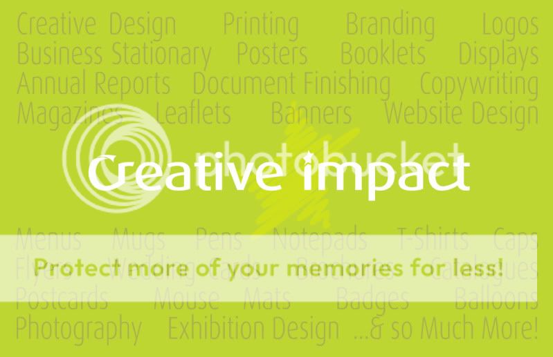
the text is 'creative impact'

i was considering using some other font because dax seems to be falling foul with designers (overused)
to but cant quite decide what to settle on. :confused:
any advice would be welcome.
 
sorry, for got to add the font.!

creativeimpct.jpg


CreativeImpactCardBK1.jpg
 
Just to let you know that "Stationery" is spelt wrong in your flyer/business card thingy :)

Other than that just a few things..

I like the name, but what value does the kerning add at the start and finish of the two words? IMO it's a design feature that actually goes against your initial logo idea.

Also, I'm not really sure why there are 20-30 words on there describing what you do... if you just put a few on like "web and graphic designers" or similar, then surely it'd stick to the phrase "Less is more..."?

Some of the words contradict each other too... like you have "exhibition design" and "creative design" (which are categories of the other words you've put down. Also, Branding, is Logo design is it not...? :)

I can honestly say "Creative design" under your company name would look a lot better than that IMO :)

Tim :)
 
Doh! thanks for pointing out the typo.
this is just the rough draft (back of business card)

i appreciate that just putting creative design on the back of my card would give a cleaner/ more professional? look, but i will be pushing the 'print' side of my business just as much (maybe more) than the design side.
and i guess for that reason, it could be appropriate to have a list of my services. it could encourage the client to ask about a particular service that they may not have thought about before.

i take your point about the kerning on the first/last letters.
i was thinking of changing the font completely as designers seem to think that this is a 'crappy- no thought' font.
so that problem should be put right.

you are right about some of the words on the back of the card being contradictory.
this was just a quick mockup to check layout.
so i will be changing some of the words too.

now tim, any idea on what type of font i should pick instead of this one?
 
I think you're right about the words in this context, just make sure they all fit in their own place and aren't just chucked on to the page.

<This is where Berry says something like "Order is the key to perfection" or similar /> :p

I'll get slagged off for this probably, but how does Abadi MT (Condensed Light) sound?

Quite a thin but bold (but not literally bold :p) font...
 
WooHoo!..i love abadi..
i was looking at franklin gothic or futura, but i think that abadi looks much better.
definately food for thought.
thx.:up:
 
Back
Top