I created this design in order to practice compositional flow and rhythm. I’m new to graphic design, and I’m looking for constructive feedback to help me improve.
This was the assignment:
”Create a poster for a bicycle race. Two elements: imagery and text; each composed in the rhythmical sequence of your choosing. Any size format. Image can be a photo or an illustration. Text: Tour de France and the year.”
TIA!")
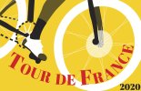
This was the assignment:
”Create a poster for a bicycle race. Two elements: imagery and text; each composed in the rhythmical sequence of your choosing. Any size format. Image can be a photo or an illustration. Text: Tour de France and the year.”
TIA!