Loupom
New Member
Hi Design Forums community !
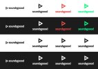
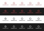
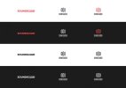
That would help me a lot if you could give me some advices about my music website logo :
- Which one do you prefer?
- How to improve it?

My website is a free music recommendation service for French people where they can listen to quality playlists based on the time of the day, music styles or moods. These playlists are handmade by French curators, for instance, sports coachs do the jogging playlists, conductors do the classical music playlists, parisian DJs do the partying playlists etc.
I am not sure the logo really matches this spirit.. what do you think ?
Thanks a lot !
That would help me a lot if you could give me some advices about my music website logo :
- Which one do you prefer?
- How to improve it?
My website is a free music recommendation service for French people where they can listen to quality playlists based on the time of the day, music styles or moods. These playlists are handmade by French curators, for instance, sports coachs do the jogging playlists, conductors do the classical music playlists, parisian DJs do the partying playlists etc.
I am not sure the logo really matches this spirit.. what do you think ?
Thanks a lot !