MuchAdoDesign
New Member
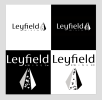
Hi all
Would appreciate your feedback on two wine logos I'm working on for my second-year graphic design degree.
The logo will be used on some traditional wine labelling but also on a new label design targeting millennials so it needs to be simple and adaptable.
PLEASE NOTE - the pattern and colour palette are not decided upon, I'm just showing how it COULD be used. I want to make sure I have it correct in black and white first. Also, the balance of the triangles isn't quite there on logo 1, I just want to see first what your thoughts are at this early stage.
Really appreciate it!
Thanks
M