You are using an out of date browser. It may not display this or other websites correctly.
You should upgrade or use an alternative browser.
You should upgrade or use an alternative browser.
Double page spread
- Thread starter shiftaltz
- Start date


SparkCreative
Member
A few things:
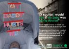
Firstly, I think it's a strong idea. You just need to make it work harder.
I'd try and shift the type away from the edge of the pram - you've got enough space not to have an overlap, which looks a bit awkward. Do that by dropping all the type down in size, particularly the body copy. It could be half the size it is and still readable as a DPS.
The NSPCC logo is a bit big too. And there's no space after the full point before 'FULL'
And why are certain words picked out in green? It makes me what to read it like this: "Of course would if was" And "I see my baby being abused." Is it deliberate? If so, I'm not really understanding the message.
The body copy needs punctuation as it's longer sentences. Full points after both paragraphs.
I really like the visual. Maybe a stronger headline would be something about babies not being able to speak for themselves, so the NSPCC will speak for them (it need to be shorter and more punchy, but that's your job.)
The body copy repeats itself. The second sentence could be cut like this: "In England and Wales, babies less than a year old are four times more likely to be killed than the average person." You need to cut anything out that you don't need.
Having cut all that, I'd add a sentence to say what the NSPCC are doing about it.
That's it.
:icon_smile:
heybyrne
Member
A few things:
And why are certain words picked out in green? It makes me what to read it like this: "Of course would if was" And "I see my baby being abused." Is it deliberate? If so, I'm not really understanding the message.
This was my first thought - I'd pick a strong word associated to what message you're trying to get out there and then highlight it a green to emphasise it further. Highlighting too many confuses the reder.
Also maybe add a tint to the pram to blend it into the background scene a little more, to me it looks a little too clean and photoshopped in there.
But I like the 'my daddy hurts me' typo, the layout and the positioning of the logos so the clarity of what they are is still there
")
Hi, thank you all for your feedback, unfortunatly I agree with you all lol and will address the problems in my future projects and work.
I enjoyed making this DPS although the hardest thing was trying to take the photograph of my new born on the street with out anyone coming over to see him (a mobile hanging from his pram saying "my Daddy hurts me" is not the best message lol)
It took me a long time to get the courage to study graphic design for fear of not being good enough ro lacking in natural tallent so I am just hoping that even with the "constructive critism" my work is still at an acceptable standard for a first year BTEC student.
Thank you again for taking the time to comment on my work and I look forward to being a member of this forum for a long time to come.