Diamond Logo Concepts- Need Opinions?

joshexam

New Member
I am not a GD professional, just making these roughly in CS6.

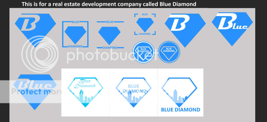
My favorite are the very first two, top left. My LEAST favorite are the one's with the city skyline inside the diamond, it is not as simplistic and reminds me of skateboarding companies, idk.

Which should I stick with and tweak a bit?

logos--Diamond.png
 
None of them currently say "real estate" to me. The cityscape is too broad a device that 'Blue Diamond' could be anything in that context.

This one only tells me the company is called 'blue', not 'blue diamond'. You're using the shape of the logo to spell out the second part of the company name, which would just lead to confusion as people will think the business is called "Blue".

Screen Shot 2016-05-26 at 17.20.38.png

Get a pen and paper and try other options, these all seem to just be variants of one idea, the diamond. Is there someway you can use a diamond shape in a less obvious way?
 
They're all the same to me. All the same shape diamond. Just with words placed around in different places.

There's no options to choose from.
 
Well since Paul was pointing out, that just having the word "blue" will associate it to much with just being a company called "blue", I'm going to stick with the one's that have the full name "Blue Diamond" or make the first one with the initials "B.D.", instead of just a big B
 
Back
Top