Critique my flyers

DanSilva

Member
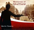
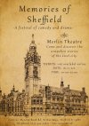
So I have to do a flyer for an event "memories of Sheffield". Some stand-up comedy, some poetry, some drama, etc. I came up with some ideas but I can't decide which one to continue. Some help here? Personally, I like the most the third one(but I am feeling is missing something there)...but I am afraid not everybody like this style...most flyers are like the first one. The second one I don't like it so much but is more suggestive. What do you think guys? What would you improve?
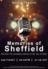
memories of sheffield 3.jpgmemories sheffield 2.jpgMomories of Sheffield old style.jpg
 
None of them shout out "comedy/poetry/drama"

1st one looks like some sort of glitz concert, old style jazz type thing - the typography is very weak.
2nd one looks like a guided tour of Sheffield - and the typography is not appealing.
3rd one looks like an old document with details about the history of the town.
 
They all remind me of book covers.

You maybe need to make is obvious what the show is all about.
 
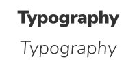
I think you need to look at the typography on them all, it's weak in places, mainly a dull font choice and overly-wide tracking. A rule of thumb I stick with is bold fonts should have tighter tracking so the letterforms sit closer together, lighter fonts should have more space between them.

typogrpahy.jpg

The first one I think feels most like a flyer, but the image doesn't sit right. Maybe the mic could be made of Sheffield steel girders or something? Try and merge 'heritage' and 'spoken word/stand-up' somehow.

Stick with it. I've been a designer for nearly 10 years and flyers are the one job I dread getting. They can be hard to get right.
 
None of them shout out "comedy/poetry/drama"

1st one looks like some sort of glitz concert, old style jazz type thing - the typography is very weak.
I know is kind of boring, all stuff aligned on center. But I saw a lot of flyers like that. Also, I don't have too many fonts to choose from (basically just what photoshop provide me). I have to invest in some quality fonts...but god...35 pounds just for one font? o_Oo_Oo_O
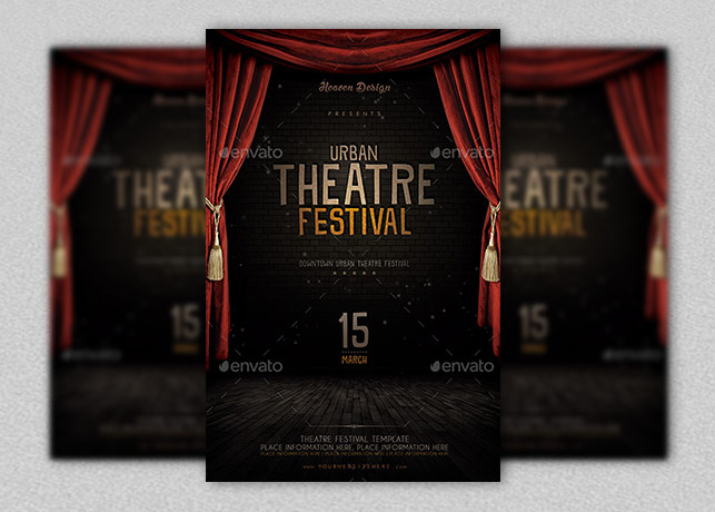
I don't know exactly how to suggest the whole concept of the event. I can just make a basic flyer for a theatre with a stage a curtain and the title in the middle but is too mainstream. (like this one)
Theatre-Flyer-Template.jpg

Can you suggest me an artist or a site where can I see examples of great and original flyers?
 
I think you need to look at the typography on them all, it's weak in places, mainly a dull font choice and overly-wide tracking. A rule of thumb I stick with is bold fonts should have tighter tracking so the letterforms sit closer together, lighter fonts should have more space between them.

View attachment 6236

The first one I think feels most like a flyer, but the image doesn't sit right. Maybe the mic could be made of Sheffield steel girders or something? Try and merge 'heritage' and 'spoken word/stand-up' somehow.

Stick with it. I've been a designer for nearly 10 years and flyers are the one job I dread getting. They can be hard to get right.
Now that you say. Yeahhhh... is look very weird. Especially the title.
I will try. Thanks for advice.
 
Also, I don't have too many fonts to choose from (basically just what photoshop provide me). I have to invest in some quality fonts...but god...35 pounds just for one font? o_Oo_Oo_O

There's a lot of work that does into designing a font, £35 is really good and you'd likely just pass the license cost onto your client anyway. I use Google fonts for most of my work because it doesn't require a purchase. There's lots of great free fonts out there, check out Behance.

You only really need a small collection of fonts anyway, I have probably less than 10 that I use regularly. Get to know them and when you'd use them and expand your collection as and when you need to. Fonts are tools in your tool box, you only need a few if you know how to use them.
 
Back
Top