Hi all,
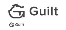
I made this practice logo for a fake brand called 'Guilt' which is an online forum for confessing their food guilt (e.g. eat/waste too much). I would really enjoy some feedback on this as I've only just got started in logo designing, but do feel free to be critical!
I'm not so sure if the logo mark is a good symbol. Can you tell what it symbolises? Also, is the logo in the small version clear?
Please criticise it / provide rooms for improvements etc!

Thanks
I made this practice logo for a fake brand called 'Guilt' which is an online forum for confessing their food guilt (e.g. eat/waste too much). I would really enjoy some feedback on this as I've only just got started in logo designing, but do feel free to be critical!
I'm not so sure if the logo mark is a good symbol. Can you tell what it symbolises? Also, is the logo in the small version clear?
Please criticise it / provide rooms for improvements etc!

Thanks