Company Logo Feedback

I think they meant as in 'power of 3', like if you'd cubed a number in maths.

Like this

Pi+cubed.png
 
Last edited:
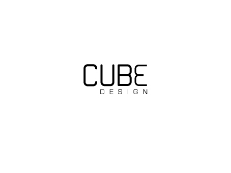
Ok I have done two more designs (just layout, font and font size). First one has the initial chosen font however the '3' is raised and in a different font, as although it's a '3' it also looks like a 'B.' The second is the font I chose for the '3' in the first design, but all letters and number are the same font and size. Which is better?

7VduX.jpg


ibkpj.jpg
 
I really like the idea 'to the power of 3' but i don't think it sits very well, the gap between the U and the E is too great. But i think you're almost there, definite improvements on your original ideas :)
 
Cheers Laura. So maybe I could make the '3' bigger to sit properly..what do you think?
 
Yes. Would you say the layout, font and font size is complete..nothing to add or improve?
 
How about the 3 and the e being the same (but facing away form each other obviously) so the e looks more like a backwards 3. Just a thought
 
yeah its looking really good now. How about making 'DESIGN' the width of the gap between U and E? Sitting just underneath it? Not sure but just an idea, see how it looks? :)
 
How about the 3 and the e being the same (but facing away form each other obviously) so the e looks more like a backwards 3. Just a thought

i'm not a designer, so not sure my views count for anything, but i immediately thought of a similar thing when i saw it
the only thing is i don't know if you'd get away with a 'raised' "3"/"E" as it might then look like "CUB" with a '3' above it.
perhaps "CUB3" (but obviously with the 3 reversed), however, you may need a different font where the reversed "3" and "E" are more distinguishable.

or alternatively you could try (i'm not convinced it'd definitely work) have "UBE" slightly raised (perhaps with 'design' offset below that, although would need a different font or colour to distinguish it though)
 
Ok I have gone away and made a couple of different designs based on your feedback. Tell me what you think:

puLBB.jpg


Vop9q.jpg
 
I like the spacing on the first, however the 3 and the E look like a mirror reflection which doesn't do much to the communication.
Have you considered using the 3 as the instead on the B?
Also, the word design looks better on the second, however I'd bring it tighter to the word.
 
Maybe it's just me but I reckon that the process here is actually getting in the way of producing a good design and for my money the very first attempt, despite its faults (all of them documented further down the thread), was more accomplished than almost anything that's come since. The mathematical 'cubed' symbol was worth exploring but I'm not at all convinced that it's working out as it doesn't look like what it's supposed to represent and therefore lacks clarity as an idea.
 
That's what I'm doing at the moment Dave. Exploring all possible avenues and then selected the best idea and improving that one. Out of all the designs I've done which do you think is the best one?
 
I meant starting "designs" at the end of the U and finishing at the beginning of the E, still keeping the '3' small, the negative space might represent a cube in itself if you see what i mean?
 
Back
Top