davewill
Senior Member
hi guys,
Im still plodding on with this church logo!
As its more of a personal project as a favour theres no strict deadline, so I work on it as and when I get a spare few hours (which isnt very often!) Ive decided to set myself a deadline to improve my work flow so Im aiming to get this sorted within the next 2 weeks.
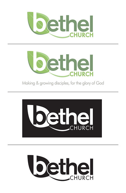
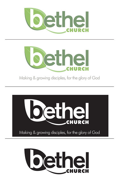
After numerous options, doodles, experiments and failed concepts Ive arrived back at the 'b' in a leaf idea. The church's mission statement is centred on growth, both in growing as a church in terms of size and helping people to grow as people, so the leaf idea is born out of that concept.
I originally struggled to find a place for the word 'church' to sit. It has to be included somewhere, (the name is too generic without it) but it always looked like it was just tagged on to the end of the logo. The swoosh aims to add some movement as well as give a space for the 'church' to sit in.
Im not sure about the colours, I want it to be modern & friendly. The leaf kinda has to be green so Ive been playing with colours that compliment that. Im trying to avoid the logo looking like it says 'ethel' so Ive used lighter colours in an effort to help the eye flow from the 'b' into the 'ethel'
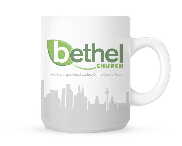
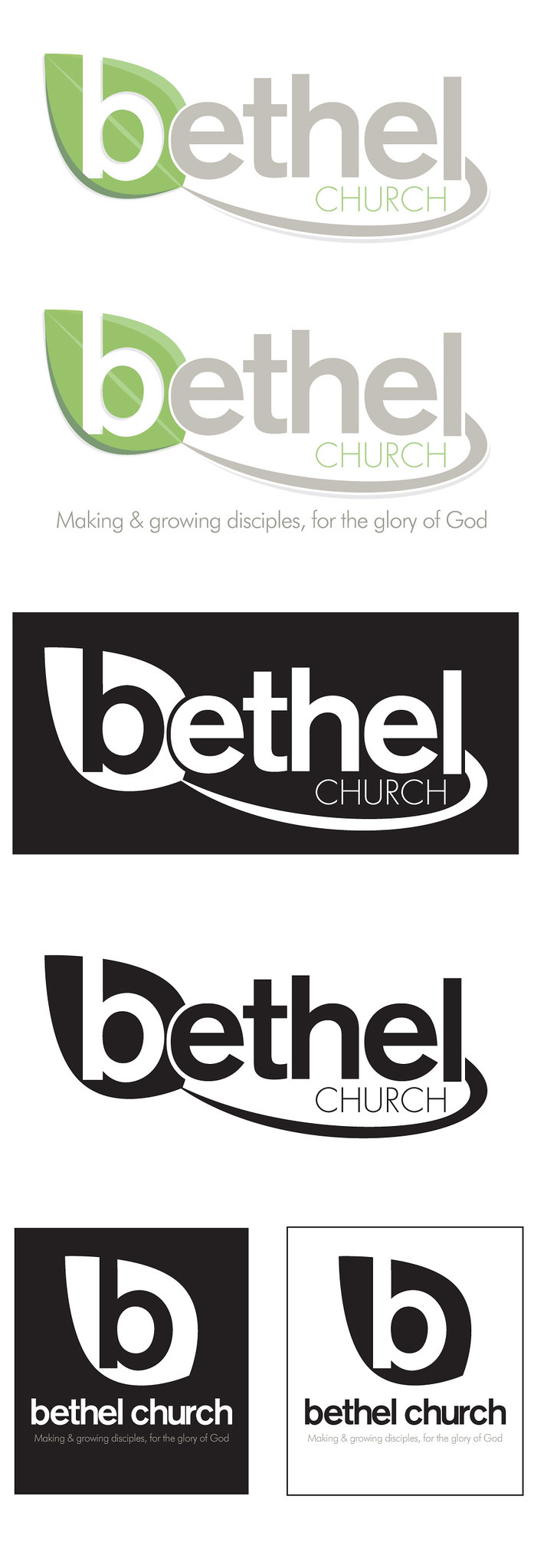
Ive shown it below as a logo, plus the logo with strapline, then a white and black out version as well as a mini portrait version that is a derivative of the master logo.
I would really appreciate any crit on all aspects of the logo, I feel like Im so close to this project now that I cant see the wood for the trees!
Im still plodding on with this church logo!
As its more of a personal project as a favour theres no strict deadline, so I work on it as and when I get a spare few hours (which isnt very often!) Ive decided to set myself a deadline to improve my work flow so Im aiming to get this sorted within the next 2 weeks.
After numerous options, doodles, experiments and failed concepts Ive arrived back at the 'b' in a leaf idea. The church's mission statement is centred on growth, both in growing as a church in terms of size and helping people to grow as people, so the leaf idea is born out of that concept.
I originally struggled to find a place for the word 'church' to sit. It has to be included somewhere, (the name is too generic without it) but it always looked like it was just tagged on to the end of the logo. The swoosh aims to add some movement as well as give a space for the 'church' to sit in.
Im not sure about the colours, I want it to be modern & friendly. The leaf kinda has to be green so Ive been playing with colours that compliment that. Im trying to avoid the logo looking like it says 'ethel' so Ive used lighter colours in an effort to help the eye flow from the 'b' into the 'ethel'
Ive shown it below as a logo, plus the logo with strapline, then a white and black out version as well as a mini portrait version that is a derivative of the master logo.
I would really appreciate any crit on all aspects of the logo, I feel like Im so close to this project now that I cant see the wood for the trees!