

@GCarlD
Well-Known Member
I don't mind the title being at the bottom, it's the treatment, or more so, lack of treatment given to the title text. Your example highlights my point:
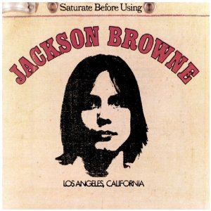
Can you see how 'Jackson Browne' bosses all of the other text? Whether it's by the stroke, the colour, the arch of the text, the difference of font that stands on its own but it still relatable; it shows it is top of the food chain of text. It has been treated in a way different to all of the text to show it is unique to the other fonts. 'Unique' I think that is the key word.
Now if you were to remove 'Jackson Browne' and replace it with your 'Timber Framed' (literally copy and paste), yes it will still be seen as the title, but it just doesn't have that same Umpthhhh.... There is no treatment of the text to make it any different or special to any of your other text.
I do like your album cover btw....
")


