PistolPete
Member
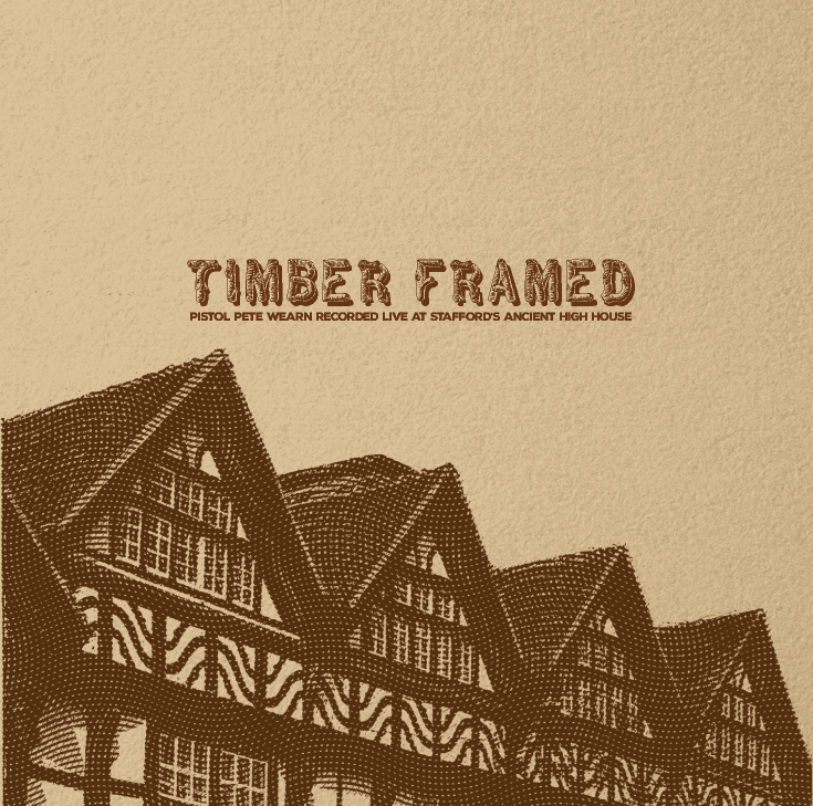
Working on a cardboard sleeve for an upcoming CD release. I'd love to hear your thoughts.


It seems a bit basic compared with your posters, a little light on design?
I would try and make more of such an iconic building.

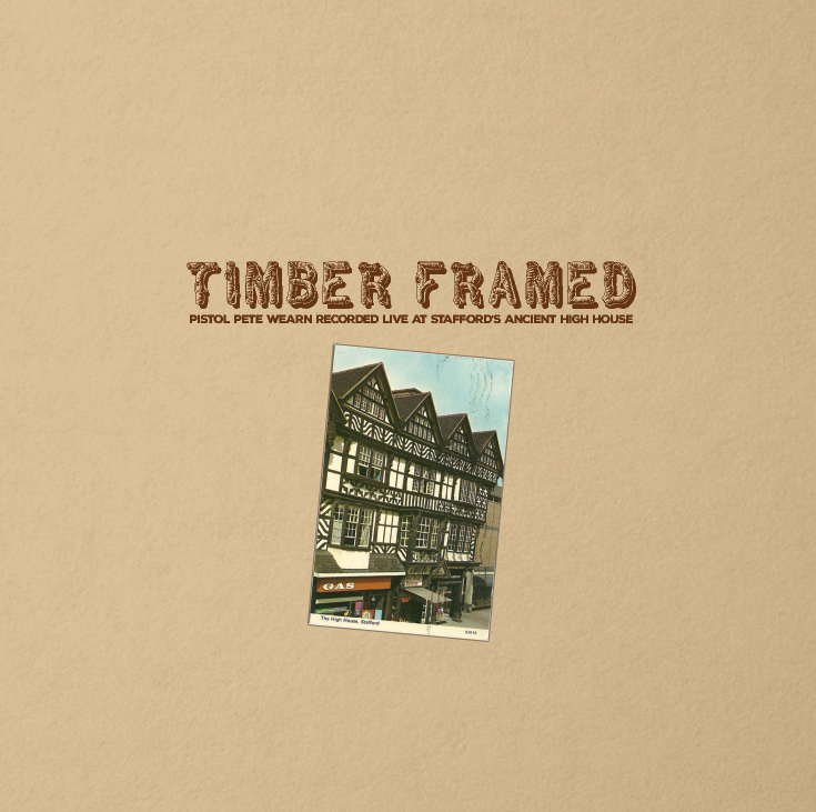
Second one is nice.
In the first. Is that an old post card?
If so, I think it would look much better a lot bigger but the fact it's portrait will make it more challenging in the square, CD format and it's not the usual landscape you'd expect from a post card so less obvious.
The drop shadow would be more visible which would help.
I think it just looks too small and a bit low in the composition which is what I think Wardy might have been getting at.
I'd be a little tempted to add some interest to the textured paper background like staining/age or something but that's just me.
Probable because I've been doing a lot of Ps work with vintage/aged stuff recently.
Maybe something like an old postage mark an shit like that.
On a slightly different note I came across a site recently and thought of you.
Has some great free resources and tut's which I thought were up your street.
www.retrosupply.co
PS. Check out the boxing poster tut + freebies.
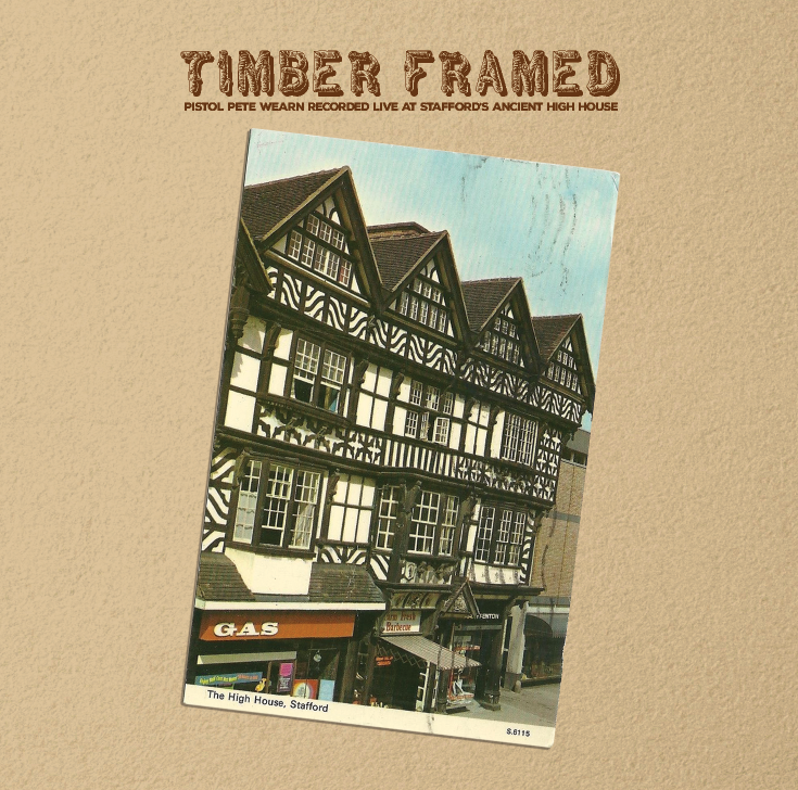
I had a play around with getting it a bit bigger:


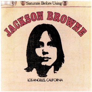
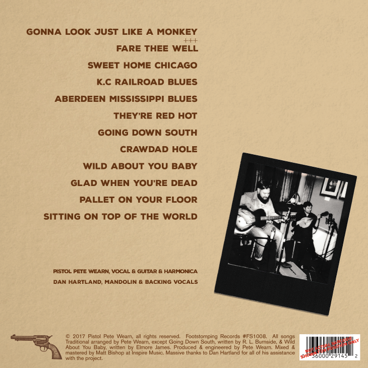
The album title needs to look more like a title. It should be dominant, top of the hierarchy, it should show all the other text that it is the boss. At the moment, it just looks like a typed out bit of text placed at the bottom with no real thought put into it.