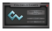
Business card for game dev company

Which one should I develop?

  • First

  • Second

  • Third

  • None


Results are only viewable after voting.

Nazaire

New Member
Hi!
I'm doing business cards for game dev company, but I'm still a newbie in design field.
So I've tried different variations, but I don't really like them. Company leader told me that it must be simple card without any particular design, but I think that it is very important for business card to have a catchy style.
What do you think of these variations? In which direction should I keep working? I think that may be fonts are my weak point, but I don't know.
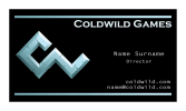
First one is the simplest variation, and company leader thinks it is the best one. In second I think there are problems with font. Third I tried to make as a profile window in game (or like pop-up window), but still it doesn't look good, however I like the idea.
Thanks for your feedback!
viz 3.png viz 2.png viz1.png
 
The first one is the direction I'm drawn to, but only because I feel the other options don't work as designs at all. I wouldn't try and force the idea of 'game elements' onto the card too much.

Company leader told me that it must be simple card without any particular design, but I think that it is very important for business card to have a catchy style.
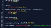
The client has told you what they want so don't try and force something else on them, you'll only infuriate them and probably waste both your time. You can still do a catchy design with simplicity, like highlighting different parts of the card details to mimic code syntax highlighting in IDE's (that idea is probably being used by a million programmers already though);

18ixl1xqnejpvjpg.jpg

This approach would basically be text in different colours. Doesn't get much more simple than that, though dos it work for members of the company who aren't programmers – artists for example. Would a 'code-esque' design imply they too are coders and confuse people? These are questions to think about and to present to the client if you present that idea to them.

Also, think about both sides of the card. A common approach is to have the logo/identity on one side and the details on the other. Here you're only presenting options for one side, think about how they both work together.
 
The first one is the direction I'm drawn to, but only because I feel the other options don't work as designs at all. I wouldn't try and force the idea of 'game elements' onto the card too much.


The client has told you what they want so don't try and force something else on them, you'll only infuriate them and probably waste both your time. You can still do a catchy design with simplicity, like highlighting different parts of the card details to mimic code syntax highlighting in IDE's (that idea is probably being used by a million programmers already though);

View attachment 4840

This approach would basically be text in different colours. Doesn't get much more simple than that, though dos it work for members of the company who aren't programmers – artists for example. Would a 'code-esque' design imply they too are coders and confuse people? These are questions to think about and to present to the client if you present that idea to them.

Also, think about both sides of the card. A common approach is to have the logo/identity on one side and the details on the other. Here you're only presenting options for one side, think about how they both work together.

Thanks! The thing is that I suggested to make a logo on one side and info on another, but company leader kinda likes to see them both on one side. But I'll talk to him once more.
 
I'd make the logo on the 'details' side a background element. Make it large, bleed it off the edge and fade it out so it's there but it's not competing for attention on the card.
 
Plus you're not thinking of long names on the business card. You've boxed in the details, what if the persons email has more than 4 letters when 'name' is replaced?

For this reason only the top works.

I don't usually do mockups to help other people, I try to encourage them to come up with better solutions. But I'm making an exception this time around - simply because it's only a business card, and if it helps it helps.

From their website I took a capture (it's actually good enough to print at business card size! sweet!)
 

Attachments

  • Screen Shot 2016-10-10 at 16.30.14.png
    Screen Shot 2016-10-10 at 16.30.14.png
    171.6 KB · Views: 10
Plus you're not thinking of long names on the business card. You've boxed in the details, what if the persons email has more than 4 letters when 'name' is replaced?

For this reason only the top works.

I don't usually do mockups to help other people, I try to encourage them to come up with better solutions. But I'm making an exception this time around - simply because it's only a business card, and if it helps it helps.

From their website I took a capture (it's actually good enough to print at business card size! sweet!)
Thanks for feedback!
The matter is I myself done these "mountains" on the web-site header, but I cannot say I like them, so in near future I'm going to place another picture there. Thus, I'm not sure that this line on card will so to say "spoke". But anyway, I'll play around with structure.
 
Back
Top