You are using an out of date browser. It may not display this or other websites correctly.
You should upgrade or use an alternative browser.
You should upgrade or use an alternative browser.
Artwork Samples Feedback appreciated
- Thread starter Elwood_graphics
- Start date


Nick M
Junior Member
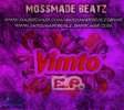
First one - erm, no thanks! Font is pretty nasty... purple colour is washing through everything making it look odd. EP is different strength to Vimto? Guessing this is some kind of cover?
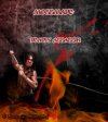
Second - nice image but again weak typography. Is it for a game or ??? Type should be big, bold, punchy and more dynamic to match the image.
Second - nice image but again weak typography. Is it for a game or ??? Type should be big, bold, punchy and more dynamic to match the image.
HippySunshine
Senior Member
Maybe a brief would help?
1st one is just messy and I dont understand what it's meant to be.
2nd I agree with Nick, good image but VERY week typography.
1st one is just messy and I dont understand what it's meant to be.
2nd I agree with Nick, good image but VERY week typography.