Argos have rebranded...

Berry said:
Questions to consider students.........
1. Why has Argos rebranded?
2. What was the objective?
3. Why spend that much money on a rebrand? - is it to make the company attractive to potential buyers?
4. It's not about liking logo's........
5. The question is not if you like the new rebrand, but why we have it.......

Berry said:
My guess it's the thick end of £30m+

That can only be of value to a potential sale value.

Expect new owners.

Argos is owned by the same company that owns Homebase > Home Retail Group

1. To appear like they're doing well and business is strong.
2. To become easier to read and to carry some resemblence to other leading (online) retailers, remind you of Amazon anyone? in a subtle way.
3. To send out a signal that all is well, and that they can afford to re-brand.
4. I prefer the new one personally.
5. Plain sailing :)
 
Anyone else noticing a similarity with the Amazon logo?
amazon.gif
 
Amazons is more clever though, it has the smile, it has the arrow from A -> Z, it is closer which makes it feel less disjointed, all in all a better logo in my opinion (and its still simple and to the point)
 
the old logo looks old, and that's normal because it is. However I think that the new one looks old too, because of its lack of originality. Many logos have the same idea of the "smile".

for exemple :
toupargel
124394.jpg


danone
danone.gif


bledina :
69898512bledina-jpg.jpg


and amazon yes, etc.
 
Maybe theyve had the management consultants in...

to quote peep show - "fire a few people and get a new logo" I prefer the old one, I think the new one looks dated already and it may be niaeve but how does spending 30m on rebranding add value to a company to sell it?
 
br3n said:
Maybe theyve had the management consultants in...

br3n said:
how does spending 30m on rebranding add value to a company to sell it?

By using the same business buzzwords that they used to get the new branding project passed in the first place, they've streamlined the brand for the ongoing challenges in the online marketplace, an asset for the future, sales from direct marketing channels have risen by 6.61% as a direct result of the rebrand?! That kinda thing?
 
It's to appear cheap and suppose to make you smile. Maybe gone more stipped back to enforce the message they take the hassle out of shopping?
 
Or that is going to be far easier and cheaper to reproduce. I'm thinking of carrier bags or sending the logo to be printed abroad.

They may even be thinking of launching stores abroad and this has brought on the change. I.e the new logo maybe more globally acceptable. I have heard of some countries not liking animated characters with big eyes, maybe the old logo was offensive somewhere in the world?!
 
Makes me wonder what is going on with some of the companies when they decide to rebrand etc. Such as a favourite cereal of mine rebranded, could never find it on the shelf and then found they had changed the design. Well, it wasn't just me who was frightened of the new design - a year later they changed the design back to something similar to the previous design and wrote a lengthy note on the back of the box apologising for the failed previous design. Makes me wonder why companies spend so much money of rebranding and choosing a design in the end which doesn't work. I know for a fact it's not the designers choice in the end either.
 
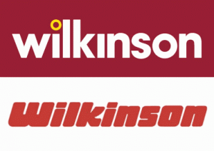
I actually quite like the look of the new brand logo, fits our time a lot nicer than the old one don't you think? My opinion is the old one was very out of date looks like something from the late 90s. The same has just happened to the Wilkinson's logo. For those of you living outside of the UK Wilkinson's is a general household store in the UK. They sell everything from garden furniture to toiletries

This is there new logo and old one below;

wilkinson_new_old_logos-300x212.gif
 
Didn't notice if wilkinsons had changed their logo yesterday :) Might take a mosey on down to see if they have, or if the old one's still up...
 
well our store has just opened in my town and they have the new branding and i drove to darlington the other day to find they have the old logo still up... wonder if there re-doing the signs in stages?
 
I can't make up my mind, the old one looks dated (reading that back sounds like a stupid comment, but I think you know what I mean) but the new one doesn't look quite right for argos. It's hardly a radical change but I think it could have been simplified a little better, not sure about choice of font - the logo looks too foreign foody if you know what I mean.
 
I really don't like it, i might be developing my skills in logo design at the moment but the new design for the logo just looks... like it took 5 minutes to design. I could never let a customer have a logo like that unless they were paying me £5.
 
Back
Top