Another Logo Feedback Thread

maskell24

Junior Member
Hey Guys and Gals,

I haven't posted for a while, hope your all doing well!

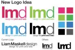
I have started to think about a logo re design. I have attached some of the ideas along with my current logo. Any feedback would be truly appreciated!

Cheers,

Liam :)
 

Attachments

  • Screen shot 2010-06-24 at 11.55.40.jpg
    Screen shot 2010-06-24 at 11.55.40.jpg
    20.7 KB · Views: 41
Hi Maskell,

I like grey black, blue and green ones because I like the different shades of colour used, but then I think the bottom right one has something aswell...the joined up "m" and "d". Well I guessed that narrowed it down lol, sorry I couldnt pinn down one or two defo ones that I liked, good job anyway though!
 
they're all clean and simple and my preference is the green.

my only issue is with the capital L... I thought at first it was IMD, not LMD. Something to think about.

all the best,
 
Thank you for the reply's :)

"my only issue is with the capital L... I thought at first it was IMD, not LMD. Something to think about" - I actually thought about after I submitted to here, and it is pretty difficult to distinguish.

" I like the different shades of colour used, but then I think the bottom right one has something aswell...the joined up "m" and "d"." I have actually gone with that Bottom right design in the end, I have attached it for your viewing.

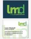
What I have attached is a potential business card design which I may get printed as early as next week.

Once again thank you for the feedback :)
 

Attachments

  • Screen shot 2010-06-24 at 14.56.35.jpg
    Screen shot 2010-06-24 at 14.56.35.jpg
    18.5 KB · Views: 13
Hi,

I initially had the same worry about the I & L thing.

Your revised logo address this, but I find the overlap of the m & d quite uncomfortable. You could try to get rid of the part of the m that invades the inner loop of the d to make it look more intentional.

Overall 'm not sure if it says enough about you, the overlap doesn't really achieve anything. The d looks a bit weak next to the L & M also.

Can you give us any reasoning behind the design, what are you trying to communicate? Might be able to help more if you can give an idea of what you're shooting for.

At the moment it seems like you're going for a 'nice' bit of typography for your identity, which is fine, but you might want to dig a bit deeper and think about what you want the logo to say, it'll represent you after all.

Sorry if this isn't all that helpful.
 
Hi Ken,

Sorry I haven't got back to you sooner. Thank you for your comments, I have since revised my logo using some the of the suggestions that you proposed.

The logo does have a deeper meaning than just a nice bit of typography. The logo doesn't just represent my design skills, it represents me in the form of the "Rock on" Sign we all know of. I saw the idea early when sketching some ideas.

I will post my refined logo in the next day or so, possibly tomorrow.

Thank you once again for your help :)
 
Back
Top