Amateur logo design learning to look professional :-)

timcools

New Member
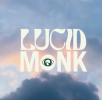
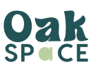
Amateur designer here! I'm running legal psychedelic retreats and due to circumstances I need to a logo for a new brand name. The first logo is created by an agency based on our previous name Lucid Monk, the next logos are made by me based on the new new, Oak Space. What are the impressions, and maybe tips on how to improve the logo?

All feedback appreciated
 

Attachments

  • Screenshot 2022-08-25 at 11.58.06.png
    Screenshot 2022-08-25 at 11.58.06.png
    360.6 KB · Views: 14
  • 3.png
    3.png
    17.5 KB · Views: 13
  • Screenshot 2022-08-25 at 08.54.33.png
    Screenshot 2022-08-25 at 08.54.33.png
    33.9 KB · Views: 14
Honest opinion - ask for your money back from the agency....

That brand logo is really bad, the 'icon' in the o of monk is so small you can't see what it is, just look at the thumbnail. Lucid would also have issues with clarity/print due to the thinness of some letters.

As to the oak space ones, they're arguably better than the paid for one although still have issues, primarily around the a in space, the ideas just don't work. I'm guessing there's some relation to (magic) mushrooms in the business so I'm kind of seeing the potential to manipulate the two a's in oak and space into a stylised mushroom while still trying to keep the a's identifiable as a's.
 
Classic case of amateur trying too hard to come up with something clever and meaningful, I'm afraid. They look dated and unprofessional and the font choice
is particularly poor. Research what others have done, search for something like 'wellness logo design' and have a look at the font choices and the modern, simple designs that
people use, rather than trying to come up with something 'trippy' that looks like it was done in the 60's. If in doubt, just have a smart namestyle or logotype.
 
legal psychedelic retreats
So the original logo has a mushroom in it.

And yours is called oak space, and there's no mention of what you do?

Lucid Monk with a mushroom.
Oak Space with a triangle.

I'm a bit lost here.

I agree the agency one is very weak.

I didn't really get what it was until reading the post.
 
Back
Top