Advice/help with logo

Wich one you like most

  • Logo 1.1

  • Logo 1.2

  • Logo 1.3

  • Logo 2

  • Logo 3


Results are only viewable after voting.

Deam94

New Member
Hi everyone,
normally im a webdeveloper, but for my client i should also design a logo, i showed her a lot of drafts and we decided us for the first one (3 variants). I will upload the 3 variants embedded into the webpage(not finished design) and 2 other drafts i made digital.
At the end im still not very happy with it and i like to recieve some feedback from you and maybe advice to improve it.

The logo is for a animal protection association, wich helps poor abandoned animals, give them a home and provide foot...

Thanks in advance ;D.
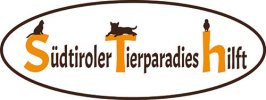
Logo 1.1
logo1.jpg
Logo 1.2
logo2.jpg
Logo 1.3
logo3.jpg
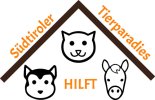
Logo 2

Logo-haus2.jpg
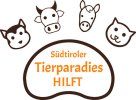
Logo 3

logonot.jpg

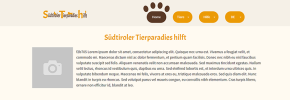
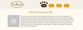
Logo 1 embedded into site:

Unbenannt.pngUnbenannt2.pngUnbenannt3.png
 
I like logo 3 - but I don't think the paw shape is well represented.
Thinner line around the text.
Maybe outline around each animal to show the shape of appendages.
 
Ok thanks for your input, please also tell me wich variant of the first one do you like, because the client has decided for.
 
Don't think any of them work....
Some might have a little potential if you remove the text in the imagery and have that separate
 
The client dont like a a short version of "Südtrioler Tierparadies hilft", because i also tried "S T H" with the animals above and below the whole text again on the first logo. That had looked a bit better at all.
 
Maybe 3, but it needs work. I'd use the animals contextually – show a dog when you're reading about dogs for example – or load one in randomly every time the page loads.

Hire me and I'll sort it for you… (y)
 
@Paul Murray Nice idea but it wont work, the site is mostly about the association and it would only work if there are exact 4 animals ... For example on the adopt page maybe it could work if their wouldnt be more then 4 animals (in real will be 5-10 and different ones every time), but also this is a small part.
 
Do a ring of the 10 animals and put the text in a paw print.

Then when the site is talking about dogs, use the dog icon, cats use cat icon etc.

Does that make sense?

It doesn't have to be a ring, they could be in a row, or a column or whatever formation you want.

But the idea would be that it would be dynamic.
 
Then it doesnt look like a paw anymore, 3 or 4 toes a paw most likely have. But i also dont like the idea very much, the client does much offline on print medias etc. Then there it doesnt match with the site and 10 animals on a logo is way to much. In my opinion it should be as simple as possible.

Or a 4 veriant:
 

Attachments

  • logo1-2-3.jpg
    logo1-2-3.jpg
    687.5 KB · Views: 3
In which case remove the aminals and just display the name of the business. There is far too much detail to see anything clearly.

Or you need a range of logos: one with the animals for posters, one without for the website/business cards and a teeny tiny one for the favicon.
 
Yeah for sure i need something similar as favicon, but the logo will never be smaller then 100px height, she told me and she like to have more animals in it.
 
Yeah for sure i need something similar as favicon, but the logo will never be smaller then 100px height, she told me and she like to have more animals in it.
It will be on a mobile phone. Unless you keep it at 100px and take up a big chunk of the screen. Even on a desktop 100px is pretty big - 50px-60px is a good size to work with.
 
It depends on the design, 100px fits very fine for me. Have seen also logos with sizes > 200-300px on very popular sites and logos with the size of 30x30px. There is no fix value to aim for.

Nevertheless all of my logos above work well with 50px too, in the example above they are ~ 65px (on the site).
 
I get that but on a phone a 100px high logo is way too big. You said to keep it simple and the way to do this is remove the animals.
 
Or even above the navbar on a sticky header. Which brings us back to the issue of simplicity.

Having the animals on the logo is unnecessary. Visitors to the site will know who they are all the logo has to make sure people know they are on the right site. A nanosecond after this the logo has no value. The logo on printed material can be different and use animals as there is more space.
 
Back
Top