A little help please.

Jordan

Active Member
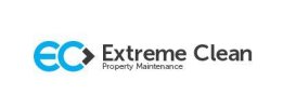
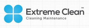
I have been designing a logo for a company who basically clean everything, well almost everything. The company is called Extreme Clean, I have litterally done loads of designs, the two I have attached are what the ones the client likes. I would like to have you thoughts on them?

The concept behind them is everything they clean with uses water in some form or another, so wanted to use water drop at its simplest form.

I have attached two samples first design is a type logo using water drops to make the EC and the second image is four water drops to form a window as a lot of their work involves window cleaning with office blocks and domestic cleans.

I would really appreciate someone elses thoughts on these as the client likes them both. Personally my preference is the first design, just not sure how other people will see it.

Thanks

Jordan
 

Attachments

  • Capture.JPG
    Capture.JPG
    6 KB · Views: 12
  • Capture2.JPG
    Capture2.JPG
    17.9 KB · Views: 10
Hi Jordan Your concept is well. If you are arrangement freelancer and give to your logo concept him. I do not see any problem here.
 
Out of the two, I prefer the one on the right (without the graph paper background though). Only thing is I can't help but feel I've seen something like that blue logo somewhere before...
 
Thanks Jim, the graph was just left on from illustrator screen grab. its been a right pain this job let me tell you. The client likes that one the best also, I have got to the point were I am sick of looking at the job tbh haha never ending. Never work for friends.
 
I agree with Jimlad that the 2nd one looks very familiar, I'm sure I've seen that icon before, but not sure where!

Out of the two I'd prefer the first one as the icon incorporates the company name and looks more original, whereas the 4 'drops' creates a shape that doesn't communicate 'water' to me and I wouldn't know about the window angle unless it was explained (I looked at logo before reading your descriptions and didn't see that) so therefore doesn't seem to have any connection with the company...

But obviously, the client trumps me!

If I was trying to make the 2nd one more 'window-like', I'd try 3 squares + 1 water drop so it looks more like a window, but that's just in my head, might look pants and sounds like you're not planning to adjust anymore!
 
From these two designs, I prefer 1st. It looks better, withot any background. Besides it doesn't need so much place as the 2nd one needs.
 
I'm leaning more towards the one on the left. The four roundish boxes on the right are common in logos and I don't think it represents the business name too well. Put it this way, if I asked you what does that symbol on the right represent? I bet you might struggle to come up with an answer. I think it's just been slapped on there just so that it "looks good"!


Now to the one on the left. I like the fact that you have made an effort with creating a symbol of some sort for the business name. Also to me it looks like some thought has gone into it whereas not much thought has gone into the one on the right! The bit I like about the logo on the left is the black arrow symbol that follows the EC letters. I think this can mean many things i.e Moving forward, expanding, greater, getting the job done (right). i think if you place that whole EC> symbol above the wording Extreme Clean then i think the balance will look right.


Hope some of what I've said helps [:)]
 
Hey all, thank you for your replies, I didn't even realised people had responded to this post.

My preference was the first one, and as you can tell the most time as spent with this concept. @Moghees I can explain the justification for all design decisions, when I design I always have a concept before I start, not just to look pretty.

Personally I liked the first concept I shown, that being said when other people have seen the second concept and have made their own connotations, people thinking it looks like a flower, window, everyone have noticed the water drops, so as a logo I think it works.
 
my selection is first one, but you need to do some changes, put drops of water on whole logo, then i think this logo will look much attractive and i hope the company will select. This is cleaning company, so you need to show water completely in the logo.
 
Back
Top