You are using an out of date browser. It may not display this or other websites correctly.
You should upgrade or use an alternative browser.
You should upgrade or use an alternative browser.
Constructive criticism for this logo please
- Thread starter dirtsa
- Start date
dirtsa
New Member
Makes me think of a meditation or spiritual business.
Hi fisicx
thanks so much for replying
Aerodyll
New Member
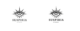
The left hand one looks nice and hand drawn, very 'arts and craftsy' but I would be concerned that it would lose it's details when used at smaller sizes or seen from a distance. So for practicality I prefer the right hand one however I think it is lacking the hand drawn look, maybe try something a bit inbetween like a finger painted style or something. If done right a literally 'hand made' look would fit the 'spiritual' feel well too.
I like the design is good, have you tried the eye with the pupil in different locations? What was the reason for having it looking up?
Also it reminds me a lot of this https://upload.wikimedia.org/wikipe..._cover.jpg/220px-Neverwinter_Nights_cover.jpg but that is no bad thing for me and these days it is hard not to look like something else out there.
I like it.
dirtsa
New Member
The left hand one looks nice and hand drawn, very 'arts and craftsy' but I would be concerned that it would lose it's details when used at smaller sizes or seen from a distance. So for practicality I prefer the right hand one however I think it is lacking the hand drawn look, maybe try something a bit inbetween like a finger painted style or something. If done right a literally 'hand made' look would fit the 'spiritual' feel well too.
I like the design is good, have you tried the eye with the pupil in different locations? What was the reason for having it looking up?
Also it reminds me a lot of this https://upload.wikimedia.org/wikipe..._cover.jpg/220px-Neverwinter_Nights_cover.jpg but that is no bad thing for me and these days it is hard not to look like something else out there.
I like it.
I see what you mean about the hand drawn look... I will try to tweak the right one a little to make it more arty (although I am not so worried about scaling down the left one as there wont be much need, will mainly be used on the website, business cards etc so will never be that small)
Suspiria in Latin means "sighs" and the reason for having it looking up is that I wanted to give it a slightly more dark melancholic look, if that makes sense
Thanks for your help and opinion, very much appreciated!
