Help with a cubed logo design

Abdesign93

New Member
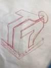
Hey, not a professional here just someone who does graphic design on the side. I'm trying to save my uncle some money in creating him a logo he wants for his new company however I have no idea on how to create this logo and make it all scale and accurate. I have average photoshop and illustrator skills so any help on how to even begin this logo will be appreciated. I have tried a few attempts even trying to use a cube outline but I have not been successful.

Thank you
 

Attachments

  • IMG-20180903-WA0004.jpg
    IMG-20180903-WA0004.jpg
    157.1 KB · Views: 9
  • IMG-20180903-WA0005.jpg
    IMG-20180903-WA0005.jpg
    113.7 KB · Views: 9
Are you attempting to make an isometric cube with the logo kind of wrapped on its surface?
 
Quick question... is it it T7, IT7, TI7 or T17?

Reading it in the correct way is going to be an issue imo, is there a reason you've gone for a 'cubed' logo?
 
Quick question... is it it T7, IT7, TI7 or T17?

Reading it in the correct way is going to be an issue imo, is there a reason you've gone for a 'cubed' logo?

It's 'T7' and I haven't. He wants it. I've attached a few simpler ideas I've done - they're not the greatest either but those are the alternatives
 

Attachments

  • T7 Logo 5.jpg
    T7 Logo 5.jpg
    120.4 KB · Views: 5
  • T7 Logo 4.jpg
    T7 Logo 4.jpg
    135.1 KB · Views: 5
  • Screenshot_20180915-163040_Dropbox.jpg
    Screenshot_20180915-163040_Dropbox.jpg
    63.2 KB · Views: 5
It's one of those where you're trying too hard and it's never going to work.

Keep it simple. Work on a combination of 4 and 5, with a better and bigger font underneath.
 
Back
Top