I can't design nuffin'

fisicx

Active Member
I build wordpress plugins and themes. The plugins are really popular and earn me a decent income. The themes on the other hand need help.

My design skills are zero and I have no idea how to fix things.

This is the site: https://onepage.aerin.co.uk/

How would you fix it?

Maybe it would just be better content on the pages, or the colours, or the font....

Points to note:
1. Can't use a logo (it not actually necessary) as you change the labels in the settings
2. The background can be changes/deleted in the settings
3. Colours are all set in the settings
4. Everything has to be simple so ensure good page load speeds.
 
I'd start by dropping the background image in favour of something a little more subtle/neutral. I normally just us a very light shade of grey or full white, possibly something from here if I want some texture – https://www.toptal.com/designers/subtlepatterns/

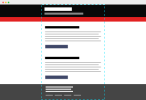
I'm also a fan of running sections right across the browser viewport as I find containing the whole content with a single column can date the look of a site, particularly with headers/main navigation. I normally have sections run full-width across a page then use a wrapper div to constrain the inner content. I normally set this width to be about 85% so you naturally get 'padding' at the edges on smaller screens without actually having to specify padding.

full.png

The main issue I see with non-designer sites is poor typography. Here it's not too bad, put I'd probably reduce the line length so help make reading faster and easier. When type runs too wide it makes reading it a chore as your eyes have to work harder to go from the end of one line down to the start of the next. Keeping the line-lengths shorter makes reading snappier. Alternatively you could bump up the paragraph font size by 0.1 or 0.2 of a rem to get the same effect.

I also only use coloured text for links. This really depends on the context but I see a lot of sites with coloured headlines that look like they could be clickable. My rule with hyperlinks is coloured and underlined, anything else that's not clickable doesn't use colour to avoid confusion.

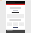
With images, I tend to break them onto their own row. You can never guarantee they will look good sat alongside user-inputted type so I let them have their own section to reduce the chance of ugliness:

centrered.png

For a single page site this this I'd centre a lot of the elements as above. For most WP themes this is a stupid idea but for a onepager like this you could get away with it

Ultimately you'll never be able to guarantee a 'good' design for the end user since a design is based around content. The best you can do is just give them a good start point so their content doesn't 'break' a design.
 
Thanks for that.

The full width option is built into the theme. You can see it in use here [link removed, seemed spammy Levi]

I also agree about the images - but their use depends on context and content.

I'm now fiddling with font sizes.
 
Back
Top