Hi, sry. for my question which might be dumb in your eyes but there are things in grafic design I'm always struggeling with.
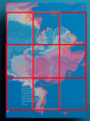
I have an example for a well designed Poster for an event.
When I design a poster, I would chose a big font or a picture which makes clear, what this poster is about.
This example seems to work even with small pieces of font.
I try to understand the way how the process of design works, but this seems to be on another level.
Can someone explain me the use of the small letters or the meaning of the square in the middle. Just explain me how this design is working and why.
Or can you tell me some websites and books that help with such problems?
I have an example for a well designed Poster for an event.
When I design a poster, I would chose a big font or a picture which makes clear, what this poster is about.
This example seems to work even with small pieces of font.
I try to understand the way how the process of design works, but this seems to be on another level.
Can someone explain me the use of the small letters or the meaning of the square in the middle. Just explain me how this design is working and why.
Or can you tell me some websites and books that help
 with such problems?