My first ever logo design

timd

New Member
Hi,

I've decided to start making a portfolio of graphic design and illustration.

Here is my first logo design. Much harder than I thought it would be but anyhow. There is a coffee shop near me called the coffee house with a very poor logo design that does not do the inside of the shop justice as the interior is really up to date. With that in mind I thought I would redesign it. I'm going for something not to wacky as the shop seems to attract 50+ clientele.

Here is my first attempt. I kinda feel like there is something missing from it... Any critique would be much appreciated!

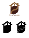
Untitled-2.jpg
 
Hi timd,

I will try and give it a shot.

First of all I like your play on words :) But I think you you can develop the logo further.

I would say this is a 'generic' logo, since the symbolic and colour choice is obvious and overused. For example, if you simply pop coffee house logo into google and have a look at the images : https://www.google.co.uk/search?q=c...u_gqHSAhUqJMAKHVkwBIwQsAQIHg&biw=1319&bih=787
you will find your combination and choice of colouring has been used frequently.

The idea of logo development is also to look what is already out there, the most obvious choice will have been done before. But no despair, your logo is an important step in your design process :)

To take a logo literal is often a good approach, especially having such visual words. try researching 'clever logo design' on google and have a look at some of those literal logo designs :)

I have attached a quick mock of your logo, highlighting messy areas (with the red circle) and what would happen to your logo when printed in black and white, plus a suggestion to include separation lines for the different elements.

Part of logo development is also to think on how it will be used, is it visible/legible when it is tiny, or does it fall apart when it is blown up to skyscraper size? How does it work in monochrome and on different backgrounds? Can it be stacked or elongated to be used as a website or banner header?

Another thing is the font you choose to accompany your logo, this is often more important than the image/symbol. Try and come up with a purely typographic solution? Have a look at different fonts. It seems that you using a lightly condensed version of Myriad Pro, have a look at other fonts.

I hope this helps to get started :)
 

Attachments

  • Untitled-1.png
    Untitled-1.png
    63.2 KB · Views: 17
Hi timd,

I will try and give it a shot.

First of all I like your play on words :) But I think you you can develop the logo further.

I would say this is a 'generic' logo, since the symbolic and colour choice is obvious and overused. For example, if you simply pop coffee house logo into google and have a look at the images : https://www.google.co.uk/search?q=c...u_gqHSAhUqJMAKHVkwBIwQsAQIHg&biw=1319&bih=787
you will find your combination and choice of colouring has been used frequently.

The idea of logo development is also to look what is already out there, the most obvious choice will have been done before. But no despair, your logo is an important step in your design process :)

To take a logo literal is often a good approach, especially having such visual words. try researching 'clever logo design' on google and have a look at some of those literal logo designs :)

I have attached a quick mock of your logo, highlighting messy areas (with the red circle) and what would happen to your logo when printed in black and white, plus a suggestion to include separation lines for the different elements.

Part of logo development is also to think on how it will be used, is it visible/legible when it is tiny, or does it fall apart when it is blown up to skyscraper size? How does it work in monochrome and on different backgrounds? Can it be stacked or elongated to be used as a website or banner header?

Another thing is the font you choose to accompany your logo, this is often more important than the image/symbol. Try and come up with a purely typographic solution? Have a look at different fonts. It seems that you using a lightly condensed version of Myriad Pro, have a look at other fonts.

I hope this helps to get started :)

Thanks for the critique Ash, i'll get on it
 
Back
Top