Hey guys, first time on here so let me say that i AM NOT a graphic designer by any stretch. Im a beat maker who has a task and i need to accomplish it by graphic design. So ive learned some very basic things in order to just make a logo.
Im using GIMP (ive heard a lot of people cringe at that so bear with me) incase you're wondering.
If you want to see my inspiration for this then search: "TheBeatPlug", "Genius" & "JukeBox Juice" on youtube.
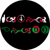
The wingdings logo was my very first logo, i thought it was pretty tounge in cheek and cool but it struggled to show up well in YT comment boxes and now that i look at it, the thing just looks off to me. so im not to concerned on the critique of that (although any would help)
The dragon logo's are my main concern, i just want to know do they look OK? Im mostly interested in the catchiness of the logo (if thats even a term used) in that i dont want it to be too detailed.
Like i said im not a graphic designer so im willing to learn anything from you guys, however basic you may think youre advice is, im sure its news to me lol.
EDIT: im aware of how pixelated the logos may be when opened (and the little artifacts), this is fine because the platforms they're used (YT, Insta, twitter, soundcloud etc) on will not show the pixelation so the logo will look smoother
Im using GIMP (ive heard a lot of people cringe at that so bear with me) incase you're wondering.
If you want to see my inspiration for this then search: "TheBeatPlug", "Genius" & "JukeBox Juice" on youtube.
The wingdings logo was my very first logo, i thought it was pretty tounge in cheek and cool but it struggled to show up well in YT comment boxes and now that i look at it, the thing just looks off to me. so im not to concerned on the critique of that (although any would help)
The dragon logo's are my main concern, i just want to know do they look OK? Im mostly interested in the catchiness of the logo (if thats even a term used) in that i dont want it to be too detailed.
Like i said im not a graphic designer so im willing to learn anything from you guys, however basic you may think youre advice is, im sure its news to me lol.
EDIT: im aware of how pixelated the logos may be when opened (and the little artifacts), this is fine because the platforms they're used (YT, Insta, twitter, soundcloud etc) on will not show the pixelation so the logo will look smoother


 may as well tackle this myself and learn from people who ARE graphic designers while i have the time on summer break.