You are using an out of date browser. It may not display this or other websites correctly.
You should upgrade or use an alternative browser.
You should upgrade or use an alternative browser.
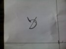
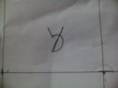
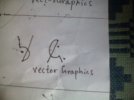
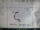
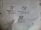
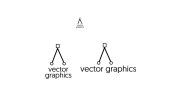
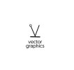
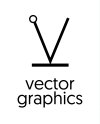
My Logo Sketches Please choose the best
- Thread starter Omer Sipra
- Start date
Omer Sipra
Member
Omer Sipra
Member
Omer Sipra
Member
Omer Sipra
Member
ok. Thanks
Omer Sipra
Member
Paul Murray
Ultimate Member
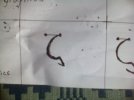
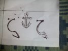
I preferred when you had the handles for the curve. With just a single anchor point you've lost the sense of it being a vector line. I'd add back in a point at the base of the V and anchor handles at the ends of the lines.
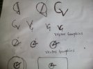
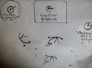
Do you need to separate the text and logomark? Have you tried adding anchor points to your letterforms so you can convey the idea of vector construction without needing to have two elements – typography and a logo?
Do you need to separate the text and logomark? Have you tried adding anchor points to your letterforms so you can convey the idea of vector construction without needing to have two elements – typography and a logo?
Omer Sipra
Member
I have seen anchor points in the letterforms in google image searches so I was trying to have a unique idea or style for my logo. I appreciate the feedback from you all. Thanks.I preferred when you had the handles for the curve. With just a single anchor point you've lost the sense of it being a vector line. I'd add back in a point at the base of the V and anchor handles at the ends of the lines.
Do you need to separate the text and logomark? Have you tried adding anchor points to your letterforms so you can convey the idea of vector construction without needing to have two elements – typography and a logo?
