Richard Powell
New Member
Hi all,
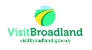
I after some advice/feedback on a logo I've designed.
In short - my brief was to design a logo for a local tourist site - visitbroadland.
I've tried to illustrate what Broadland has to offer - which is to focus mainly on the wide open sky's and lush green/yellow fields that you can cycling, walk through. Something that looks inviting.
I've tried to keep it simple, bright and colourful. Logo's are not my strongest point even though I'm a graphic designer - I take my hat off to designers who can knock them out within a few hours.
So I'm at the beginning stages of this design so any suggestions/ideas would be gratefulyl received.
Cheers
Richard
